DATX X-Wealth — AI stock-investing app
X-Wealth is DATX's consumer fintech app — turning dense market data into clear signals, rankings and portfolios, with copy-trading and an AI Broker, for 10,000+ Vietnamese retail investors. The v2 work rebuilt the app on a tokenised design system.
- Role
- UI/UX · Design System
- Timeline
- 2023
- Team
- DATX Technologies · cross-functional
- Scope
- App UI across 8 feature areas + design-token system (v2)
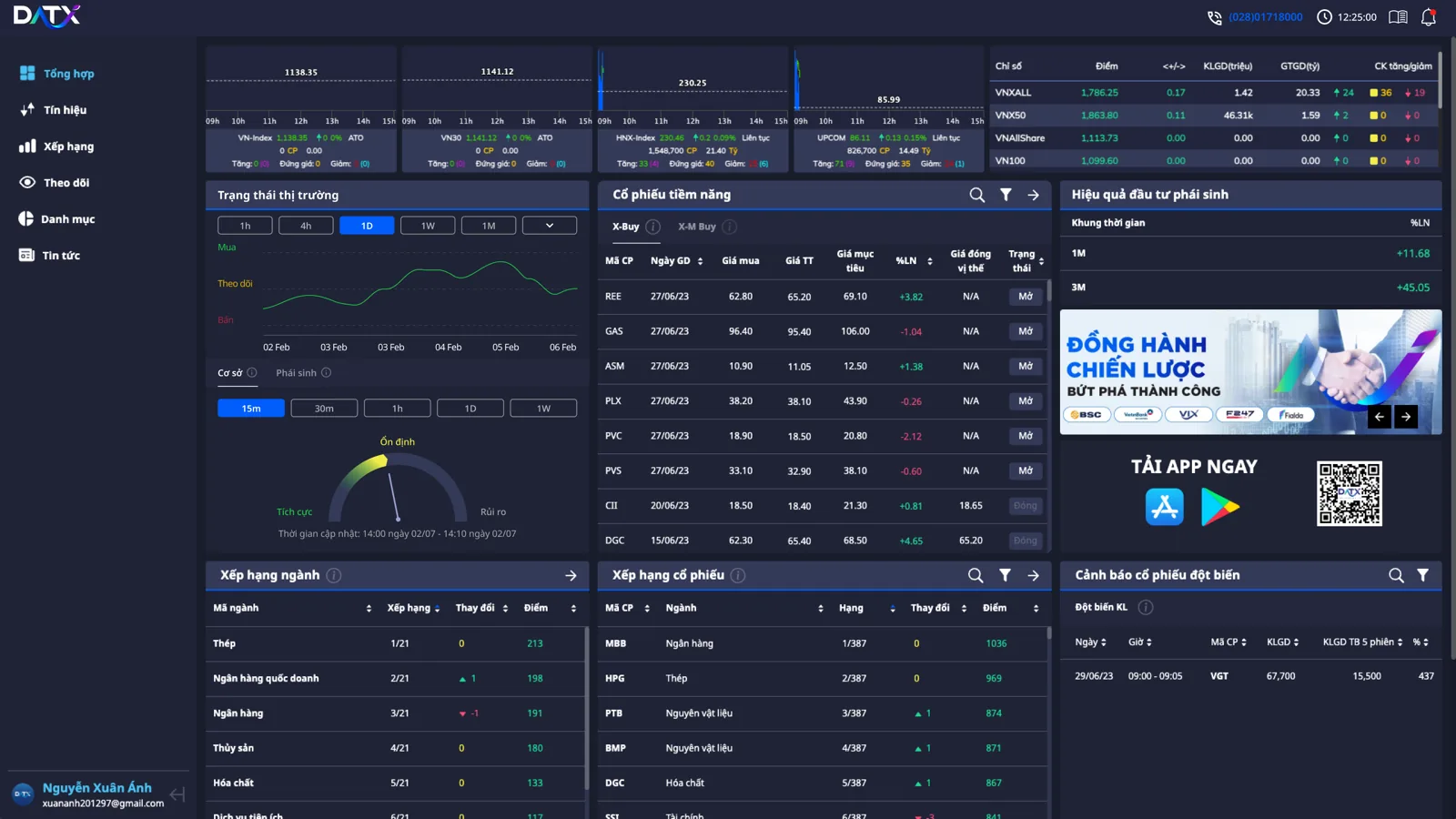
Retail investors face overwhelming, jargon-heavy market data — and in trading, a misread number costs money. The v1 app's inconsistent UI and weak colour contrast hurt both trust and accessibility. It needed a calmer, decision-first interface and a scalable system across eight feature areas.
10,000+ investors · order 65→82%
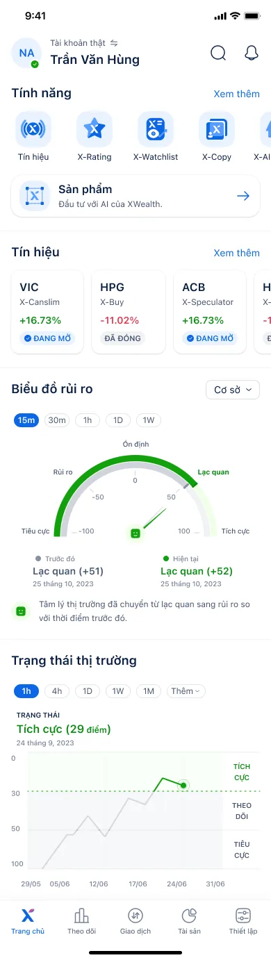
I mapped the investor decision journey — watch, read the signal, decide, then copy or trade — and structured eight feature areas around it.
- Organised the app into clear areas: overview, signals, rankings, portfolio, copy-trade, AI broker, research and pricing.
I rebuilt the product on design tokens and fixed the colour system to meet accessibility contrast — so the app scales consistently and reads correctly under pressure.
- Tokenised colour, type and spacing; reset the palette for WCAG contrast; wrote the design principles.
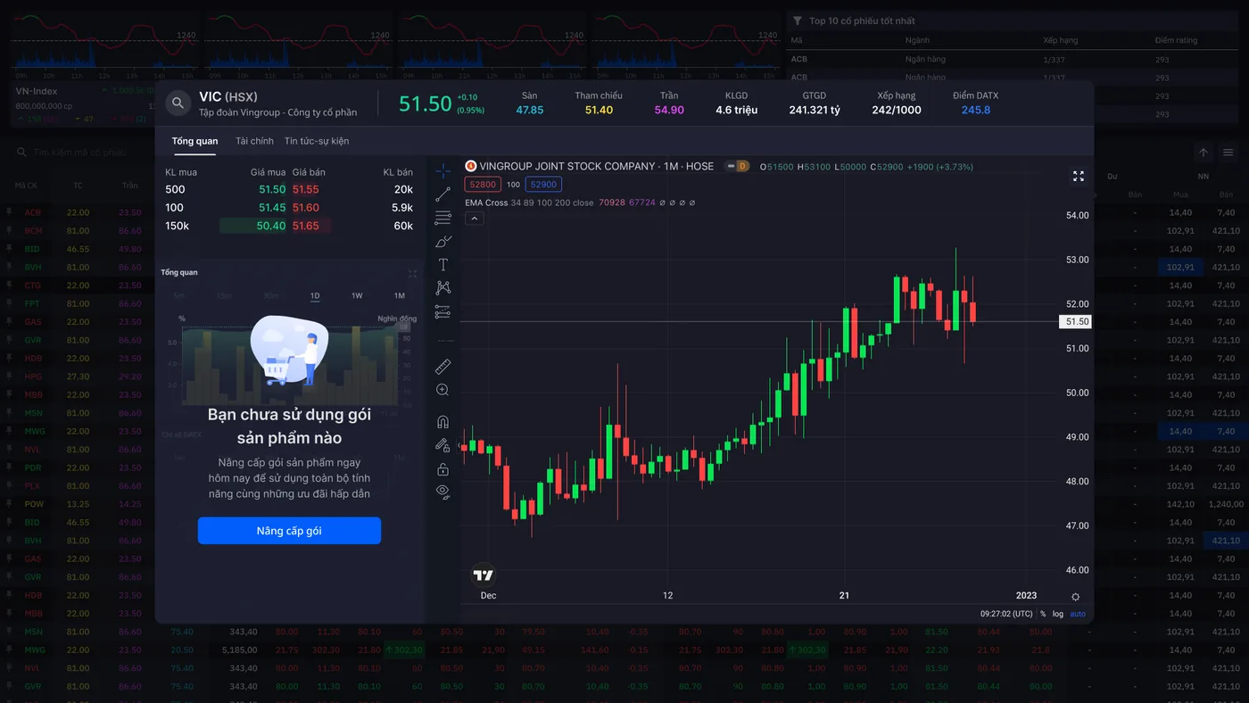
A data-dense but calm interface that turns market noise into glanceable signals and rankings, with status-driven colour.
- Designed high-fidelity flows for signals, copy-trade and the AI broker.
- 01
Discover
Mapped how retail investors actually decide — where the data overwhelms and trust breaks.
- 02
Systemise
Rebuilt the app on design tokens and an accessible colour system so eight feature areas stay consistent.
- 03
Design
Designed the decision-first flows across signals, portfolio, copy-trade and the AI broker.
Design tokens before screens
Rebuilding on tokens made eight feature areas consistent and far faster to extend — the system did the heavy lifting.
Fix colour for trust
I redid the palette for WCAG contrast because in trading a misread figure costs real money — accessibility here is a trust feature.
Two token tiers, on purpose
Benchmarked Spectrum, Polaris, Carbon and Fluent v2, then shipped only reference + system tokens — skipping the full four-tier model — to rebuild eight feature areas fast without over-engineering.
Switchable real / demo, one UI
After studying eToro, Mitrade, Coinbase, Bybit and OKX, I met the board's 'merge demo and real accounts' ask with a switchable mode behind an identical interface — satisfying stakeholders without confusing investors.
 01 / 0902 / 09
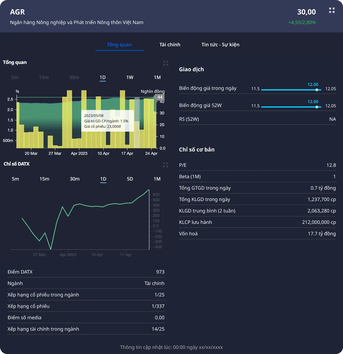 03 / 09
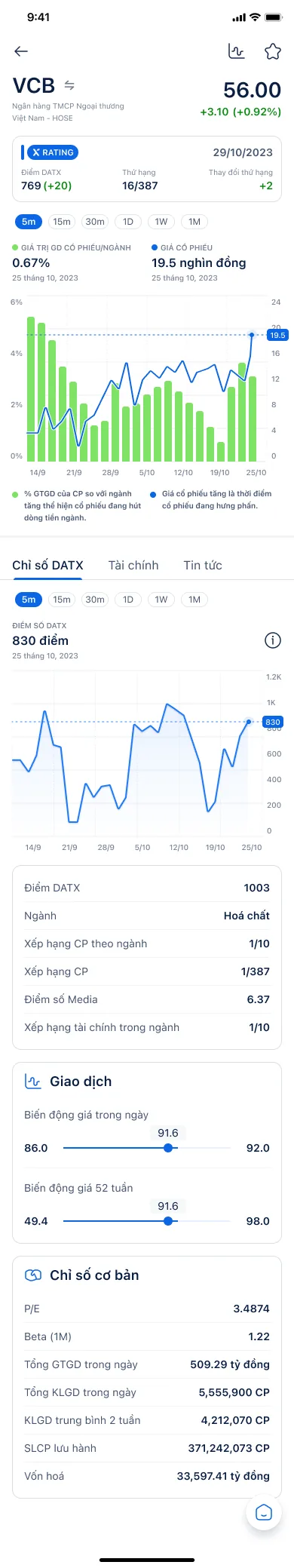 04 / 09
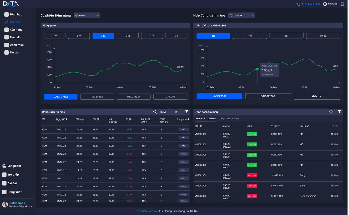 05 / 09
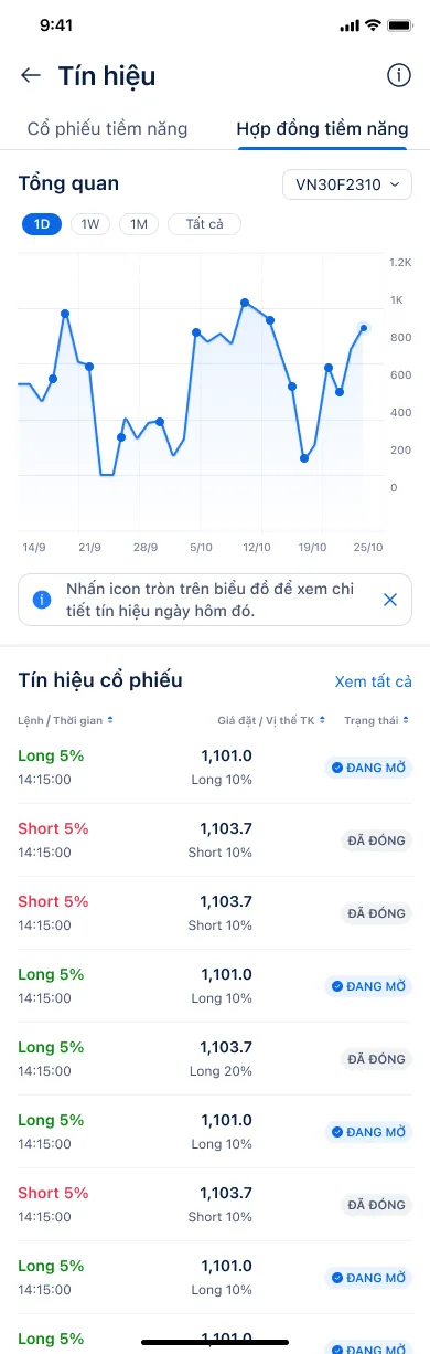 06 / 09
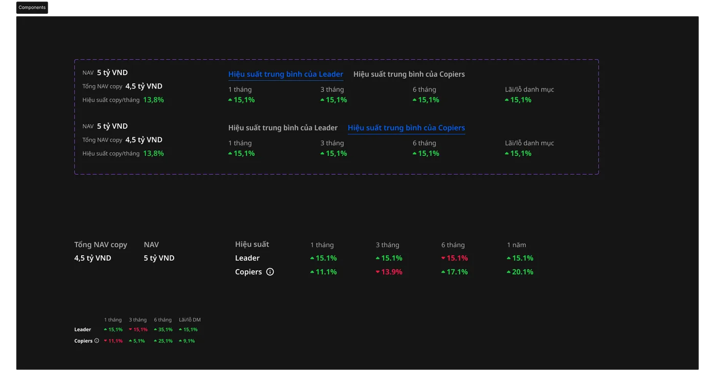 07 / 09
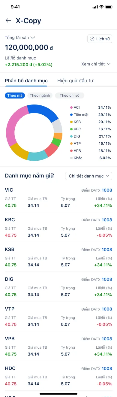 08 / 09
 09 / 09
- ✦Order completion 65% → 82%
- ✦Referrals drove 30% of signups — CAC down ~70%
- ✦Served 10,000+ investors / 8,000+ DAU; app rated 4.6/5
In fintech, clarity is the product. A tokenised system and an accessible colour palette turned a noisy, jargon-heavy app into a calm decision tool — and proved that accessibility and trust are the same thing here.