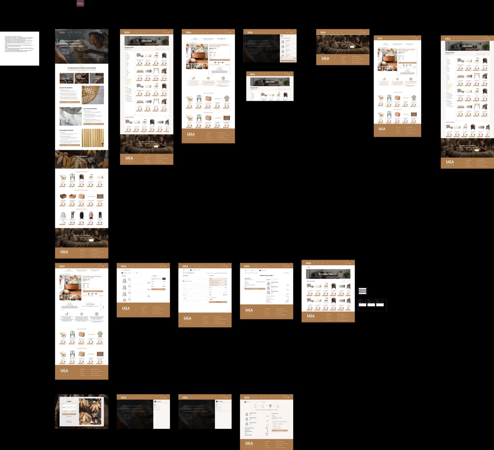
Là Lá — wooden-handicraft e-commerce
Là Lá sells handcrafted wooden goods. The work began with research & strategy, brand naming and positioning, a natural-materials moodboard, and a full sitemap, then ran through a 40+ template information architecture to 80+ high-fidelity screens for the storefront. It contributed to a $100K+ seed round.
- Role
- UX Research · UI
- Timeline
- 2022
- Team
- Early-stage craft brand
- Scope
- UX research + 40+ template IA + 80+ screens
A craft brand needed an online store that conveyed warmth and craftsmanship while handling a broad catalog, which meant getting the information architecture right before any visual design.
- 01
Research & strategy
Studied the users and catalog, explored brand naming & positioning, and set direction with a materials moodboard.
- 02
Architect
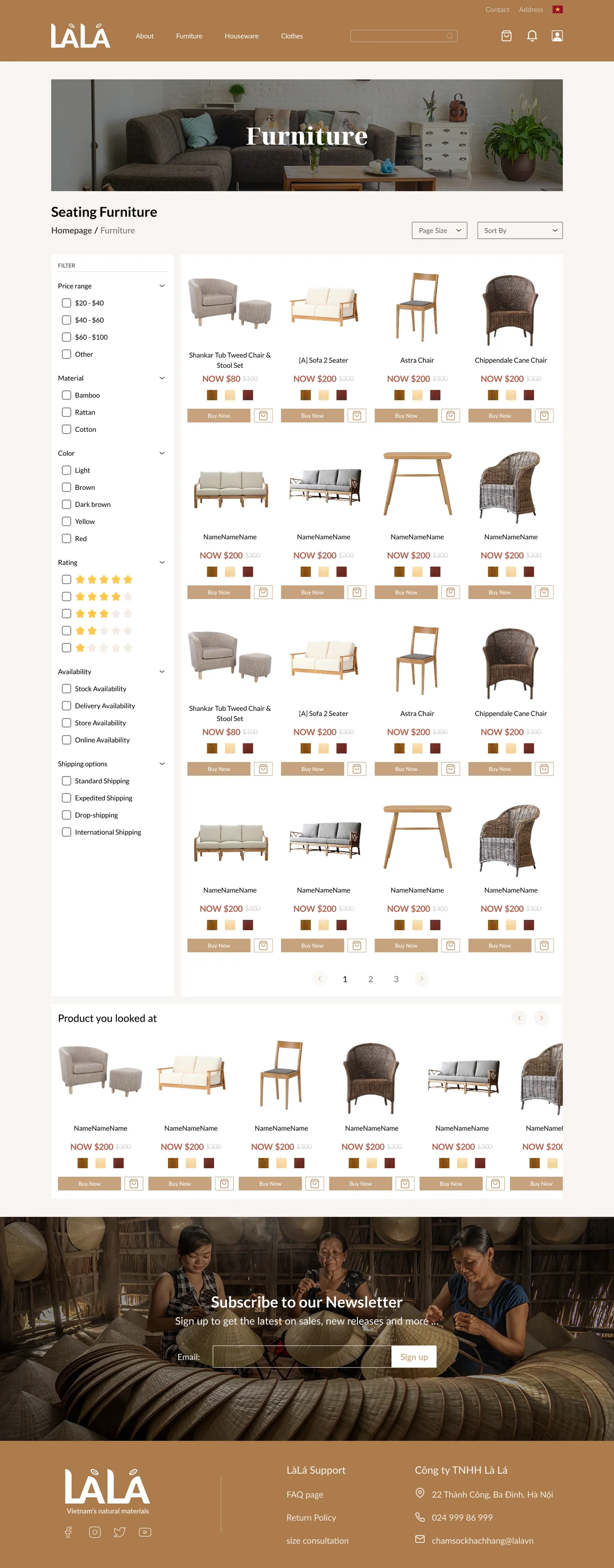
Built a 40+ template IA to keep a large catalog navigable.
- 03
Design
Designed 80+ screens for a warm, product-forward storefront.
Name, position, mood — then design
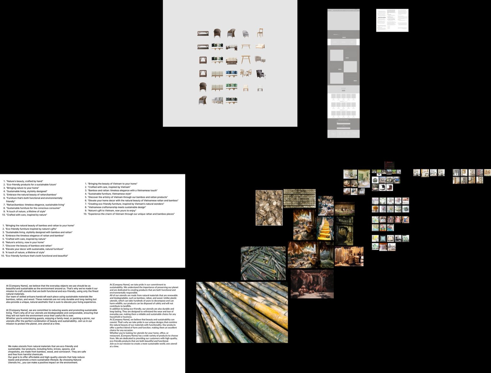
The engagement started before the brand even had a settled name, so the first deliverables weren't screens but decisions: positioning statements, whole pages of candidate taglines circling one promise ('crafted with care, inspired by nature'), and a moodboard built from the materials themselves, bamboo stalks, rattan weave, artisan workshops. Grey wireframes sat beside the mood photos from day one, so structure and feeling were negotiated together instead of one being retrofitted to the other.
Colours sampled from wood, not trend boards
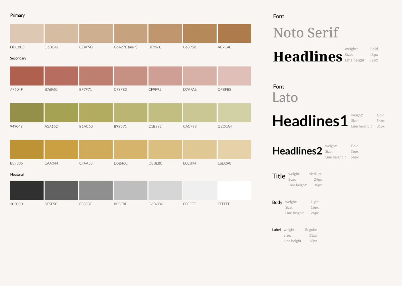
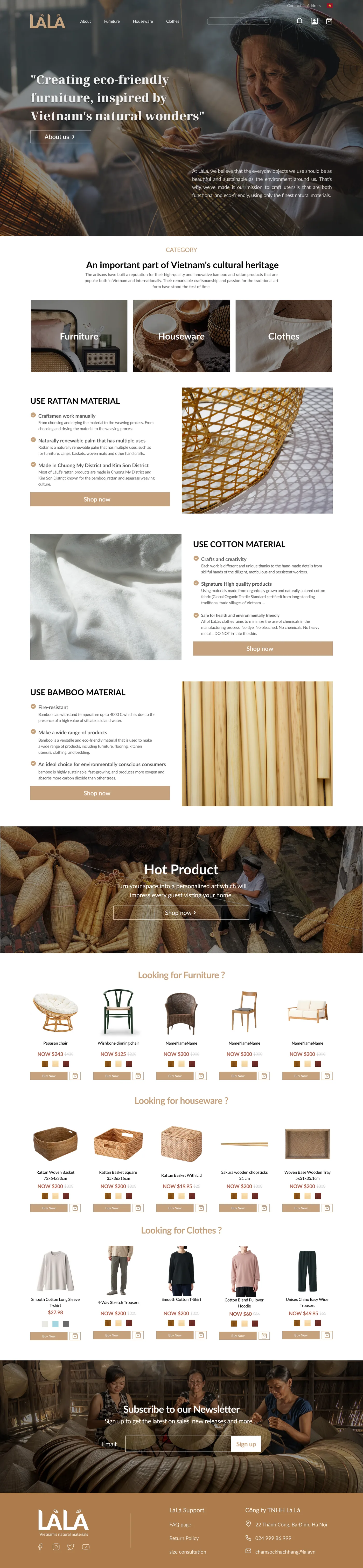
The visual language was sampled from the workshop: a primary ramp of rattan browns, secondaries in clay red, leaf green and honey yellow, each scale stepping softly enough to build whole layouts without a single loud pixel. Type does the same double duty: Noto Serif gives headlines the voice of a maker's label, while Lato keeps body text and prices plainly legible. Warmth is the brand; the disciplined ramps and a full neutral scale are what keep 80+ screens of it coherent instead of mushy.
Architecture before aesthetics, in practice
A craft catalog is deceptively hard to structure: furniture, houseware and clothing under one roof, each browsed a different way. The 40+ template architecture was designed before any visual polish, so every listing, filter and detail page had a defined home. Even the filters carry the brand: shoppers narrow by material (bamboo, rattan, cotton) the way the artisans themselves sort their work, alongside price, colour, rating and shipping. Structure going first is exactly what lets the warm surface feel effortless.
Handmade has to survive next to a price tag
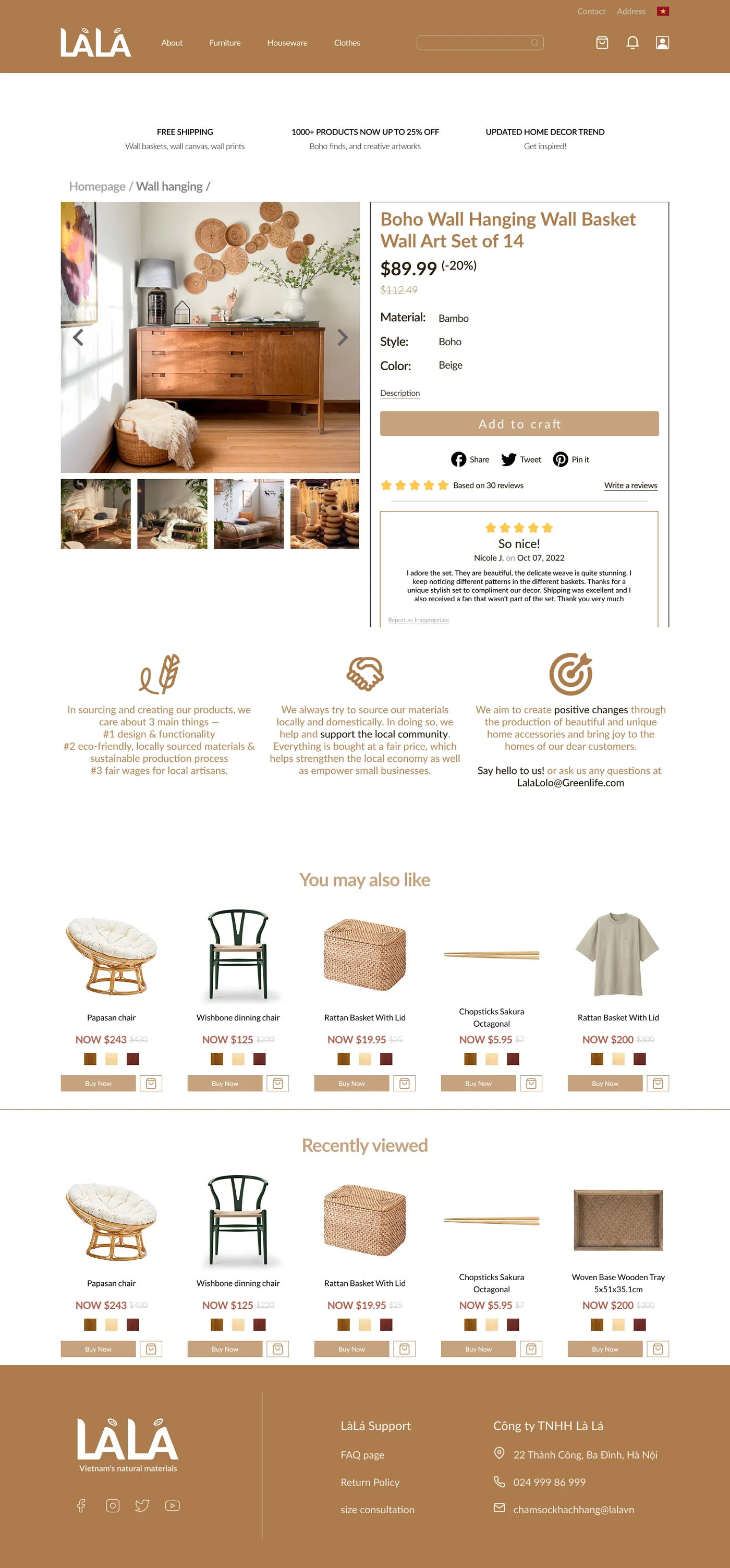
The product detail template gives the object room, a large lifestyle gallery, material and style stated plainly, reviews from real buyers up front, and then, mid-page, pauses commerce for provenance: three quiet columns on locally sourced materials, community and fair wages for artisans, exactly where a hesitating buyer looks for a reason to believe. Cross-sell rails return below. The order is the design: fall for the object first, trust the maker second, and only then be asked to buy.
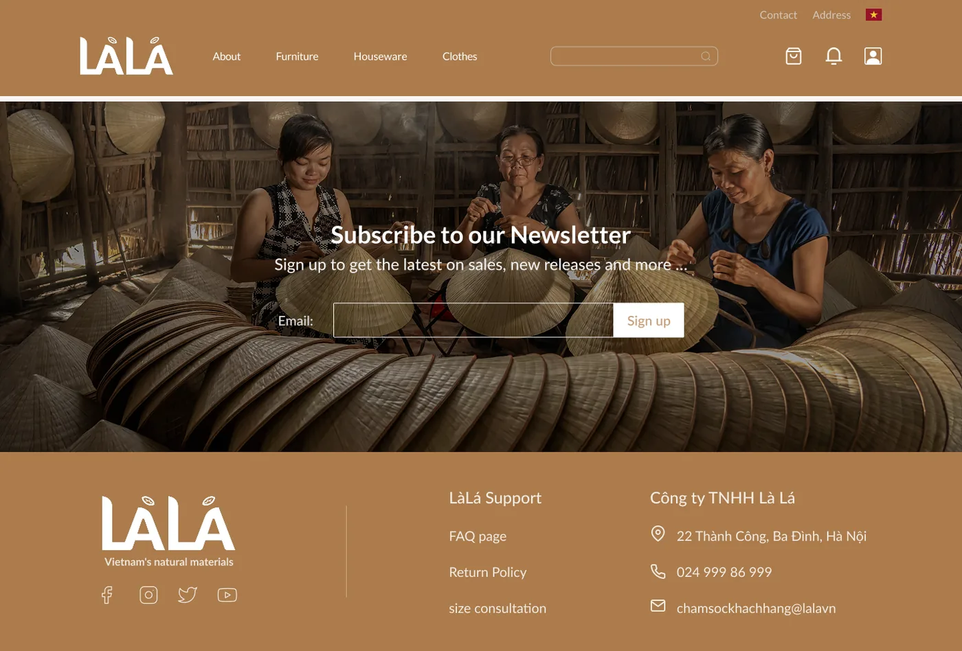
Structure and warmth aren't opposites.
Architecture before aesthetics
A deep IA kept a large, varied catalog navigable. The structure had to be right first.
Let the craft lead
Generous imagery and a warm tone so handmade products feel as special online as they do in hand.
 01 / 0602 / 0603 / 0604 / 0605 / 0606 / 06
- ✦40+ templates and 80+ high-fidelity screens
- ✦Contributed to a $100K+ seed raise
For a craft brand, structure and warmth aren't opposites. The catalog only feels warm because its architecture holds firm underneath.