AIM Exhibition — three landings for one pop-up, and the one that won
AIM Exhibition supports Korean H&B brands joining a three-week pop-up in Hanoi's K-TOWN. The landing had to sell participation to Korean sellers, and it ended up existing in three versions. B and C are both mine, C designed first as a long-term, reusable base for many future events, B created when this edition committed fully to health & beauty; A is a different animal entirely: the company itself issued an official one-page A4, and my job was to rebuild that artifact on the web exactly as printed, buttons included, creativity excluded. Living with all three on one event turned this project into a rare, honest A/B/C study of what a landing is actually for.
- Role
- UI/UX + requirements analysis + front-end + QA, solo
- Timeline
- 08/2026
- Team
- Solo — brief & review by the event operator
- Scope
- BA gap analysis · 3 landing versions · KO/VI i18n · seller app QA
One event, three different definitions of success. B and C had to answer a design question, which voice convinces a Korean seller to ship products to a pop-up abroad: reassurance or excitement? A had to answer a discipline question. Can you web-rebuild a printed A4 so faithfully that the company that issued it can't tell the difference? And underneath all three sat the same unglamorous floor: two languages, real forms, and users whose browsers carry stale state from every previous build.
3 landings, 1 event — B chosen official
- 01
Read like a BA first
Extract 15 client-written files to machine-readable text, reconcile three conflicting versions, declare Korean v3.1 the single source of truth, and send 15 findings + 6 questions upstream before drawing.
- 02
Two directions head-to-head
Design B and C as complete, comparable pages on one information architecture, then let the operator choose a voice, not a mockup.
- 03
Rebuild the official artifact
Sample colours from pixels, cut assets from the scan, refuse to redraw what is already printed, and stop reconstructing the moment fidelity would require faking.
- 04
Localise without inventing
KO/VI on every page; anything the original lacks comes from an approved source or stays empty until real data exists.
- 05
QA at console level
CDP listening for exceptions and failed requests, a click-everything pass, hostile-data tests for stored state: evidence, not impressions.
Fifteen files, three formats, three versions at war
The project opened with a folder, not a spec: 15 files (2.8 MB) written by the client side themselves, no BA attached. Requirements in Korean at v3.1, the Vietnamese translation stuck at v2.0, and the dev team's mockups tracking v2.0 too. They didn't just differ in version number, they differed in business logic: v2.0 auto-assigns a support centre, v3.1 lets the business choose; one screen v3.1 had deleted was still being built. Before drawing anything I extracted every document to machine-readable text so comparisons could be grepped, not remembered, then declared one source of truth out loud: Korean v3.1, dated. The spec had one more trap. It referenced a design guide and nine appendices that turned out to have never existed, because the documents were AI-drafted on the client side. Rule learned cheap: before chasing a referenced file, ask whether it's real.
Fifteen findings, and one checkbox with legal weight
Reading requirement codes one by one against the wireframes surfaced 15 findings, four of them hard gaps: an export-experience field the wireframe never drew (I added three choice cards plus a reassurance line, because asking about experience without stating why invites flattering answers); half of a marketing-interest requirement silently dropped; a missing brand column in the SKU table; and carton dimensions captured as one free-text box, which can never compute shipping volume, so it became four numeric fields with CBM calculated on the spot. The finding I weigh most: the spec demands five separate mandatory consents, the wireframe had merged two of them into one line. Permission to use your images is not the same commitment as supplying evidence documents. Merging the ticks weakens what the consent is legally worth. I split them back into five and added a one-tap agree-all so rigour didn't cost friction. Six questions went back upstream instead of being guessed (centre lists, deadlines, quota data, login policy) because presentation is mine to decide; business data and rules are not. The loop closed both ways: the BA came back with the centre list I'd filed as question one, and reviewing the operator's own mock-up turned into a two-way document, where their file drifted from the spec, and what my design should adopt from theirs.
Why B beat C
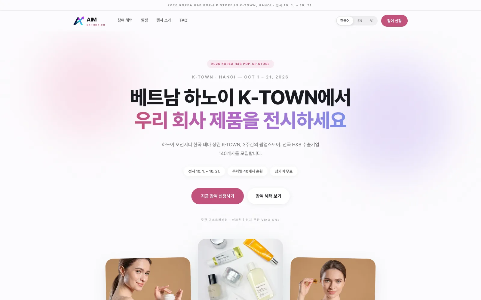
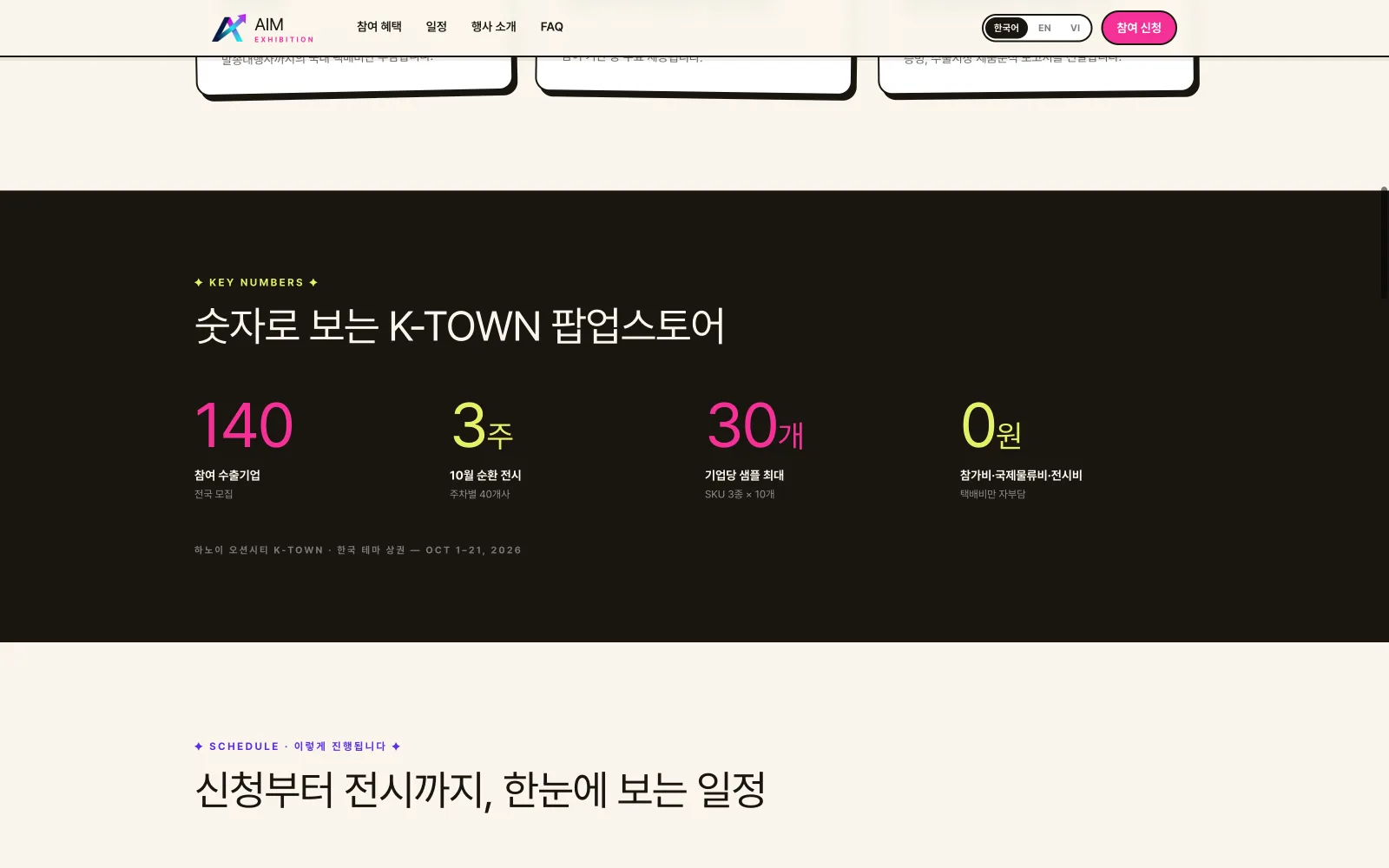
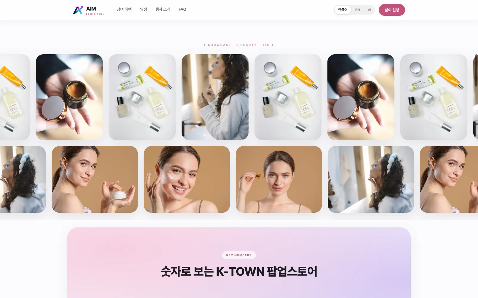
C and B were never twins. They were two answers to two different briefs I set myself. C came first, built for the long game: a loud event-signage system, cream paper, a marquee running like signage over a K-TOWN street, tilted tickets, a spinning FREE-ENTRY pill, neutral to industry, ready to reskin for many different events without redesigning from zero. Then the scope sharpened: this edition would focus entirely on health & beauty. A page shouting 'event!' suddenly answered yesterday's question. So I switched horses and committed B to this one industry and this one moment: white space, a soft violet-pink gradient headline, a centred hero, product and model cards, the calm, credible voice a beauty buyer already trusts. B was locked as the official page; C stays in the drawer as the multi-event platform it was always meant to be, waiting for the next edition.
Version A: rebuild the company's paper, exactly
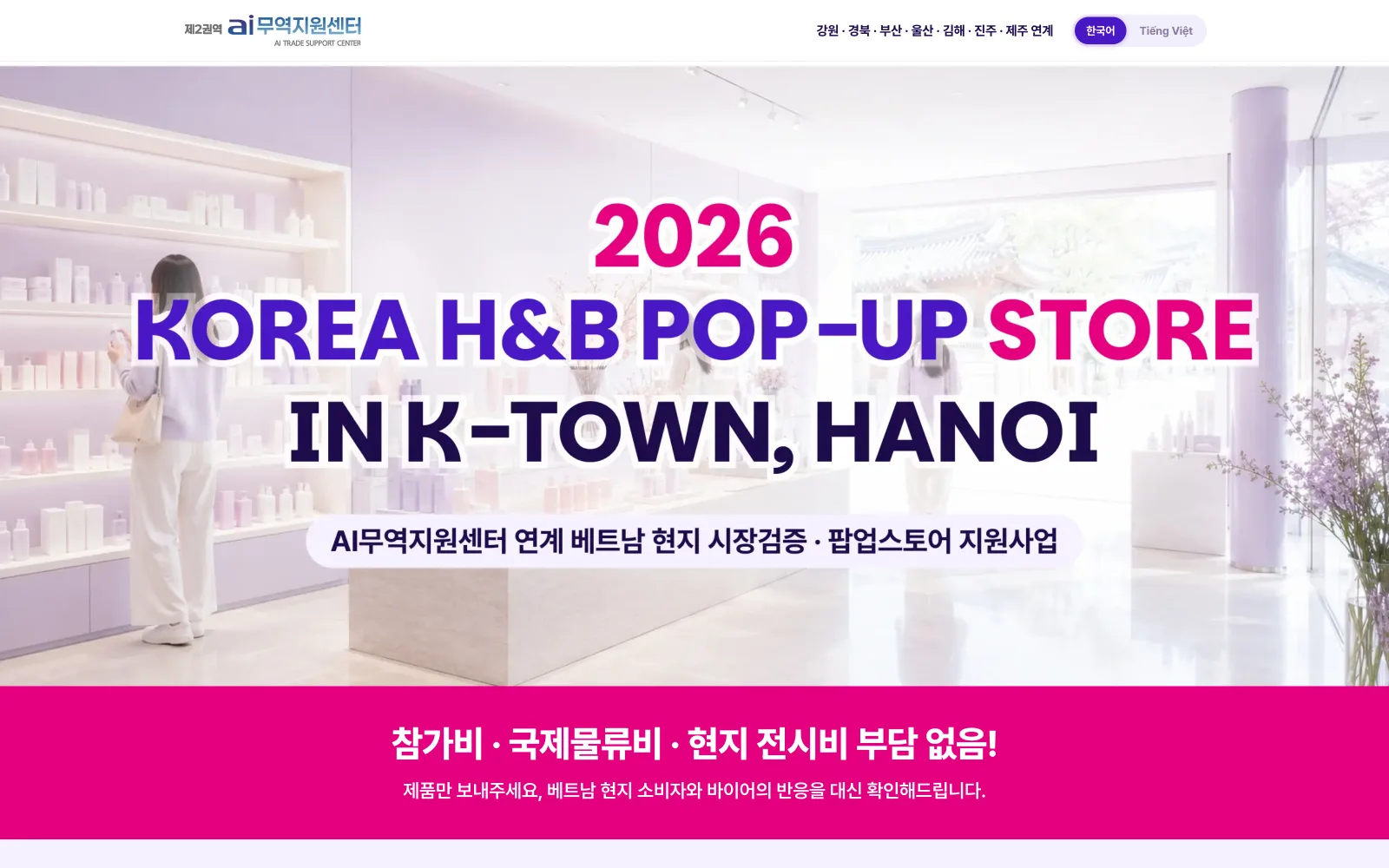
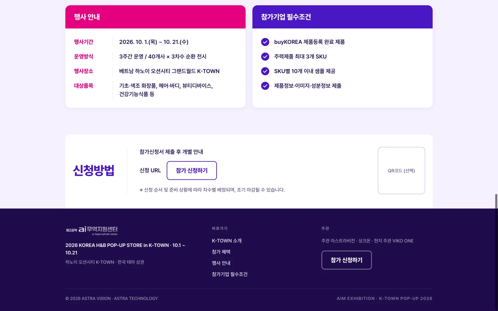
The brief for A was one sentence: this isn't my design, don't learn from it, just rebuild it as a working web page. With a print artifact, 'same' is a measurement, so the palette was sampled out of pixels (#E4007F, #4A17C4, #1E0B4B, #F6F1FF) and every asset was cut from the original scan. The craft here isn't invention; it's restraint precise enough that the issuing company sees their own document, now with buttons. And I'll say the quiet part out loud: judged as a marketing landing, A fails my own bar, it's a printed page standing stiffly on a screen, with no web hierarchy, no conversion rhythm, none of the craft B and C carry. It exists to honour an official artifact, not to sell. Both things are true, and a portfolio should be honest enough to hold them together.
Business first: why B and C out-sell A
Put all three on one yardstick, not 'which is prettier' but 'which fills 140 booths fastest'. A is the company's official one-pager put on screen: as print it does its institutional job with real authority and perfect consistency, and that deserves respect. As a landing it fails the business test on every line: an A4 composition can't reflow, so mobile gets a shrunken poster; the pitch is a wall of facts with no order of persuasion, nothing tells a busy seller what to read first; one apply button lives far below the fold, never repeated, never urgent; the fee waiver, the programme's single strongest objection-killer, is buried in body text instead of shouted; and a headline trapped inside artwork can't be translated, tested or tweaked without reissuing the file. B and C were built backwards from the KPI, applications submitted. Value proposition above the fold; dates, slots and 'free' as scannable chips; the money answer visible in the first second (C literally spins it in a sticker); organisers named where trust is decided; one primary CTA repeated at every scroll depth; and native KO/VI so a seller's decision never waits on a translator. Same information, opposite economics: A reports the event, B and C sell it.
Three wrong diagnoses, then the real one
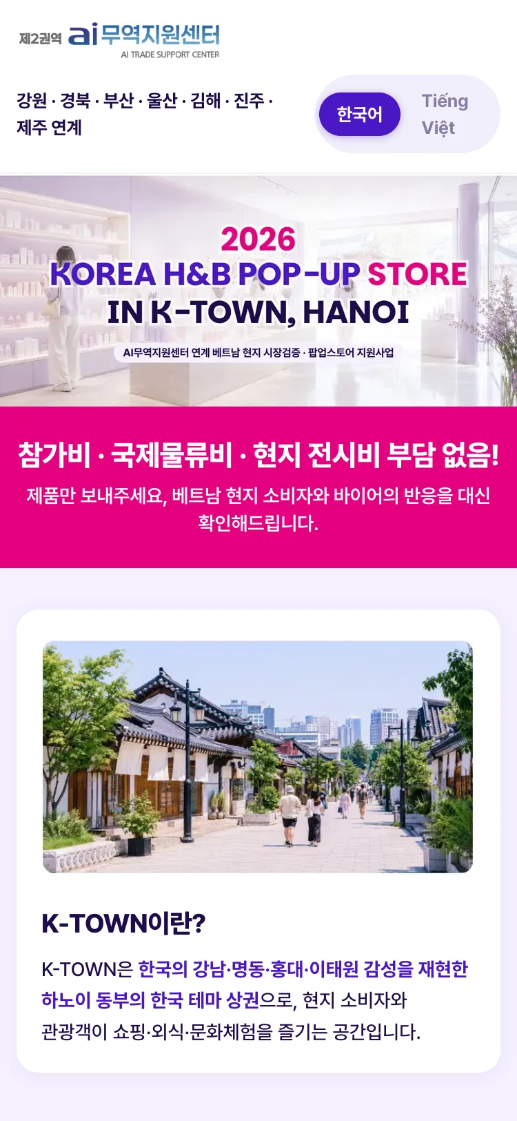
The hero rendered with two overlapping titles. Hypothesis one: a screenshot ghost, re-shot with full compositor flush, still doubled. Two: fonts not loaded, waited on document.fonts.ready, still doubled. Three: double-rendered DOM, grep found the heading class twice, but querySelectorAll counted exactly one; the second hit was just Next's RSC payload. The truth was an assumption, not a bug: the hero strip cut from the poster already had the title printed inside it, and I had typed the same words on top in HTML. An inpainting rescue (OpenCV TELEA + NS, saturation-and-darkness mask dilated 13px) was tried and rejected. It erased the text but ate the model's hair and touched 19.2% of the image. The final call: keep the artwork intact, drop the HTML layer, and serve meaning through a clip-path-hidden h1 and full alt text.
A Vietnamese strip and an honest footer
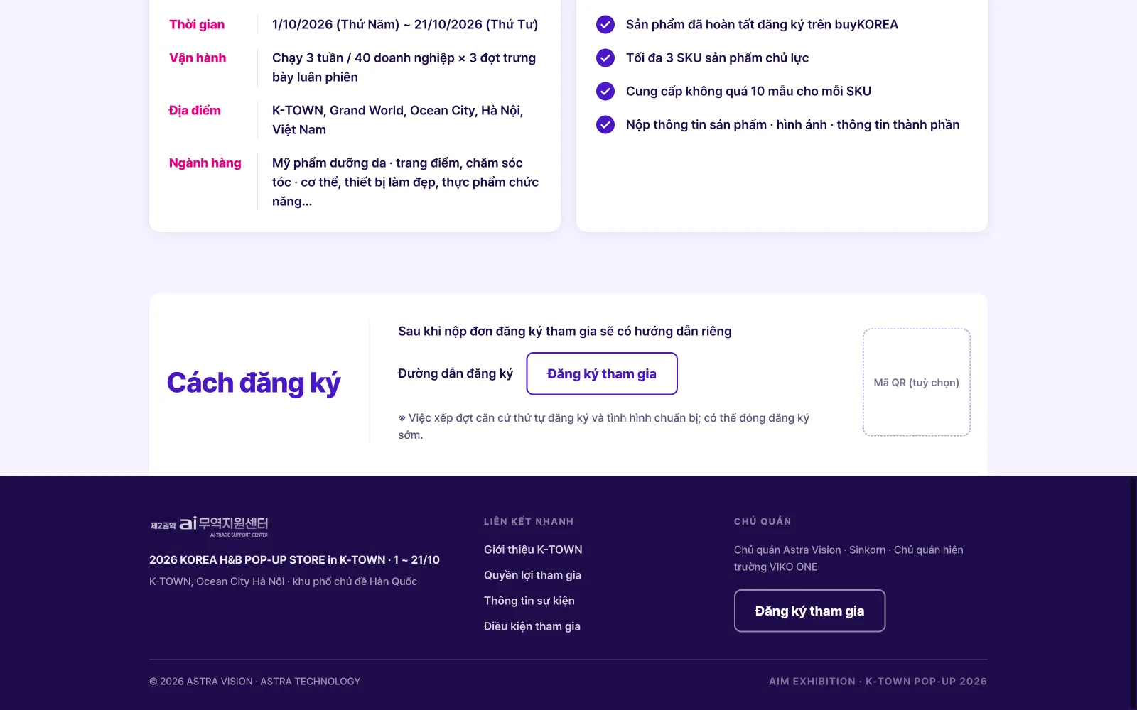
Two additions threatened the 'exactly as printed' promise. The Vietnamese build couldn't translate a headline that lives inside artwork, so only the VI version gets a narrow strip under the hero carrying the translated title, while the Korean page stays 100% faithful. And the requested footer needed contact details the paper never had: instead of inventing them, the operator/venue/copyright strings were lifted from the already-approved sibling landing, the contact block was left empty until real data arrives, and the footer earns its keep with in-page anchors and a second apply button. When the original has gaps, legitimate words come from an approved source or from asking, never from filling space.
The tester is always cleaner than the user
As a user on my own machine, I kept hitting an error that my three QA passes had called clean. The reason: my headless browser always starts with an empty profile, while a real browser carries localStorage state from every earlier build, and each newly added form field turned an old saved state into value={undefined}, flipping controlled inputs to uncontrolled. The fix refused to be another patch: a migrate() that lays any old state over the full empty template, verified against deliberately hostile data, truncated JSON, null rows, a state that is literally [1,2,3], consents of the wrong type. All four pass silently. QA itself changed too: from screenshots to CDP-level console listening, because a screenshot is blind to exactly the class of error users actually hit.
The winning design isn't always the shipped design
After B was locked as the official page, the final call came from the operating side: the event would run the company's own one-pager at the root URL, the exact artifact I had rebuilt as version A, with B and C parked on archive routes. I disagreed as a designer and understood it as a business decision in the same breath: this is a government-adjacent programme, where every public surface must match the paperwork that ministries, partners and applicants already hold in their hands. Authority beat conversion, and for an institution, authority is the safer bet. Two things still made this a good outcome. First, the switch cost minutes, not days: three versions living in one codebase behind scoped styles meant re-pointing routes and nothing else. Second, the faithful rebuild I had been openly sceptical about turned out to be the decision that mattered most, because A existed as a real, pixel-true web page, the company could go live in its official voice instead of pasting a screenshot into a div. The design that wins the argument isn't always the design that ships; building so that any of the three could ship on a phone call is design work too.
Drag to judge them yourself
Top: my two competing directions for the same brief, C's editorial-poster energy against B's clean-commercial calm. Bottom: version A in its two languages; the hero headline lives inside the printed artwork, which is exactly why the Vietnamese build carries a translation strip beneath it.
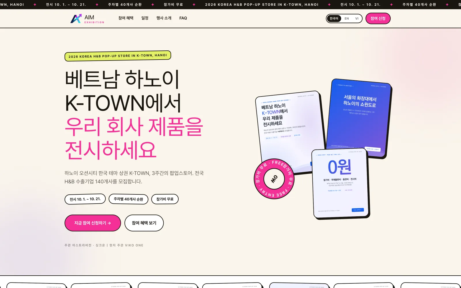
Direction C vs B — B won · drag the divider
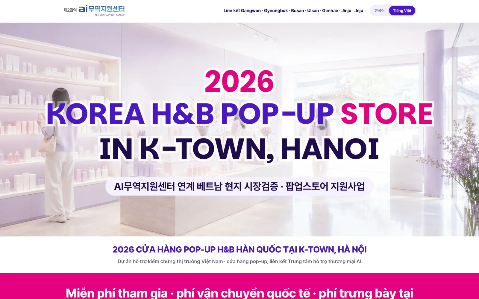
Version A — Korean vs Vietnamese · drag the divider
Measure. Don't guess.
Pick the voice that matches the lifespan
C was designed as a reusable multi-event platform; when this edition locked onto health & beauty alone, I switched to B (built for one industry, one moment) and locked it as official. Right page for the current question, not the general one.
Stop reconstructing when fidelity breaks
Inpainting that touches 19.2% of an image is not 'exactly as printed'. Keeping the artwork intact and hiding a semantic h1 preserved both the paper and the machine readers.
Change the instrument, not the effort
Three 'clean' verdicts came from tools that couldn't see the error class. Curl sees status codes, screenshots see pixels; only console-level listening sees what users see.
01 / 0502 / 05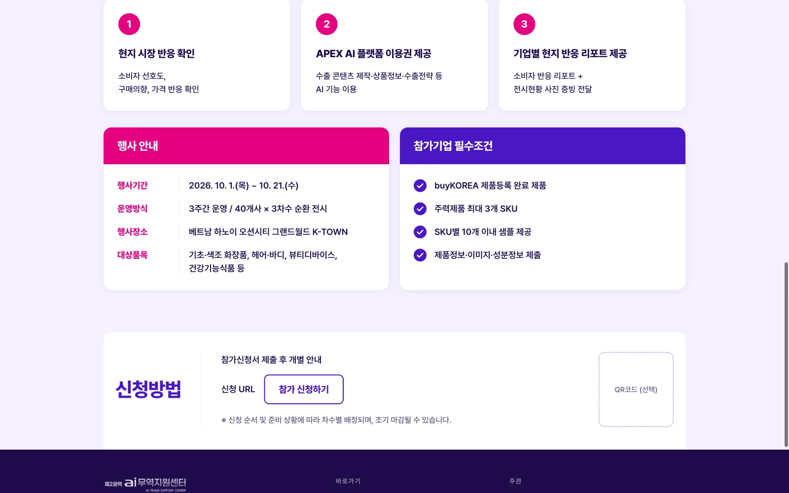 03 / 05
 04 / 05
- ✦A BA-grade gap analysis delivered before any pixel: 15 evidence-backed findings and 6 decision questions; the four missing mandatory fields were then designed for real. Each annotated in the data model with the requirement code that created it.
- ✦Version B locked as the chosen design; the operator's final call put A (the company's own one-pager) live at the root, a switch that took minutes because all three ship from one codebase with style scopes that never collide, B and C standing by on archive routes.
- ✦Build and lint pass, zero console errors across seller and admin in three languages (~180 scripted interactions), hero gap 0 at 375/768/1440.
- ✦A migrate() layer that makes every future form field safe against users' stale saved state, verified with deliberately corrupted data.
This project taught me three different kinds of honesty. Design honesty: putting two finished directions side by side and letting the louder one win on argument, not on my attachment. Craft honesty: admitting that 'exactly as printed' sometimes means not rebuilding, the inpainting worked technically and still deserved rejection. And QA honesty: my tools kept telling me what I wanted to hear until I gave them ears for the console. If I did it again, I'd ask for the source design file before rebuilding anything, classify what's 'background' versus 'printed content' on day one, and make change-the-block-nature → re-sweep-its-CSS a mandatory checklist item instead of a lucky catch.