Vikoone — K-beauty market entry, Vietnam
Vikoone (VI×KO) helps Korean beauty brands enter and lead the beauty wave in the Vietnamese market: 'from strategy to execution, built for real growth.' The work spanned the brand identity, a credential / design guide and the public homepage.
- Role
- UI/UX · Front-End · Brand
- Timeline
- 2025
- Team
- Astra Technology
- Scope
- Brand identity + homepage + front-end
A young market-entry brand needed an instant, premium first impression (credible to Korean beauty partners, warm to the Vietnamese market) and one consistent identity across the website and its sales materials.
- 01
Position
Found the story: Korean beauty riding the wave into Vietnam, 'from strategy to execution'.
- 02
Brand
Built the VI×KO identity and a credential / design guide to keep it consistent.
- 03
Design & build
Designed the homepage and shipped its front-end at staging.vikoone.com.
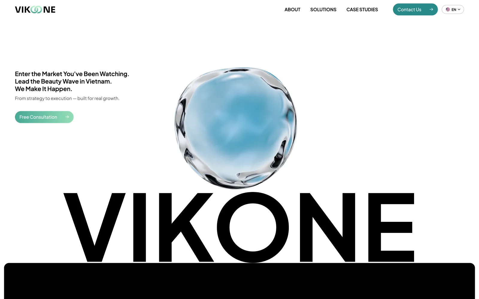
One glass blob instead of a thousand words
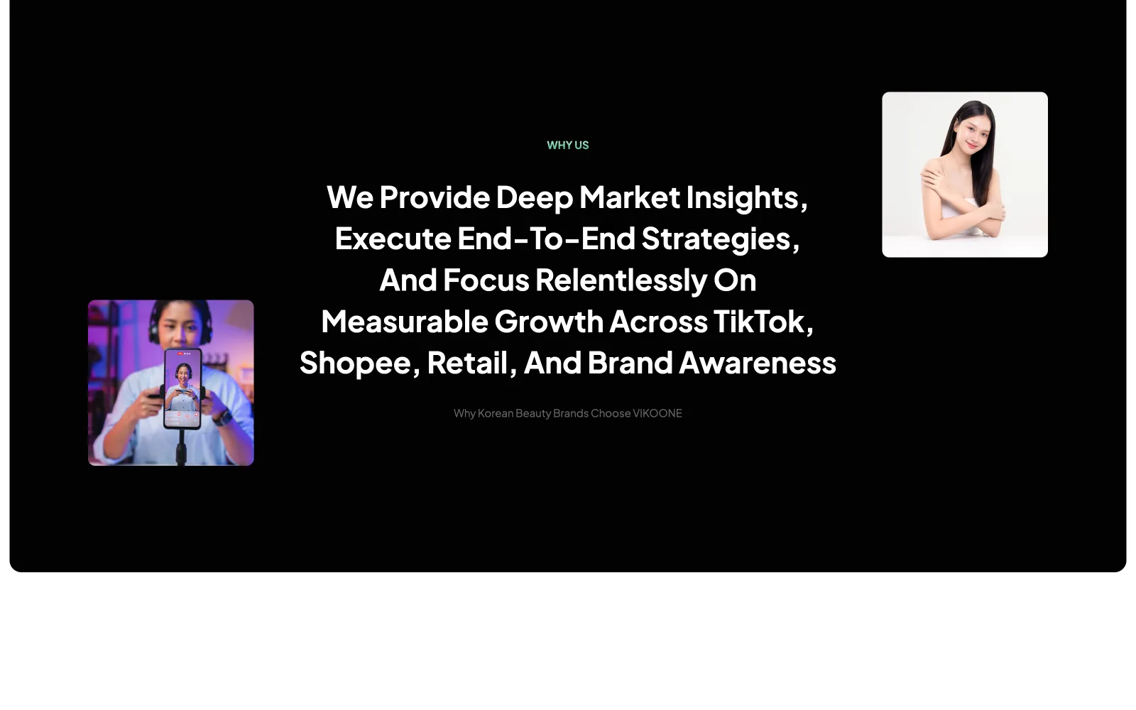
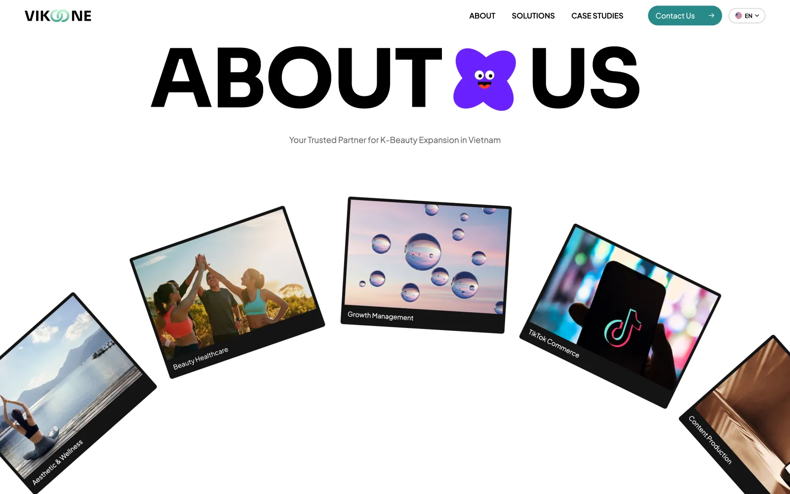
A beauty-commerce agency needs to feel both premium and alive. The identity bets everything on restraint: a single liquid-glass blob floating over an oversized wordmark, black-and-white statements, and photography of real creators. No gradients-everywhere, no stock collage: when the whole page is calm, one moving object carries the brand. The dark WHY-US panel then slams the contrast: statement typography at poster scale, creators flanking the words like proof.
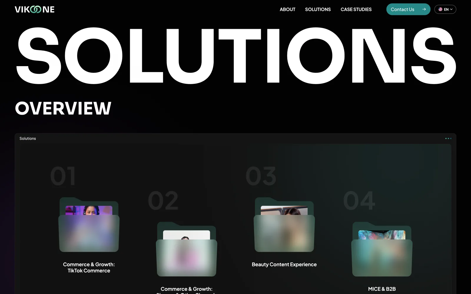
Four solutions that fly in on scroll
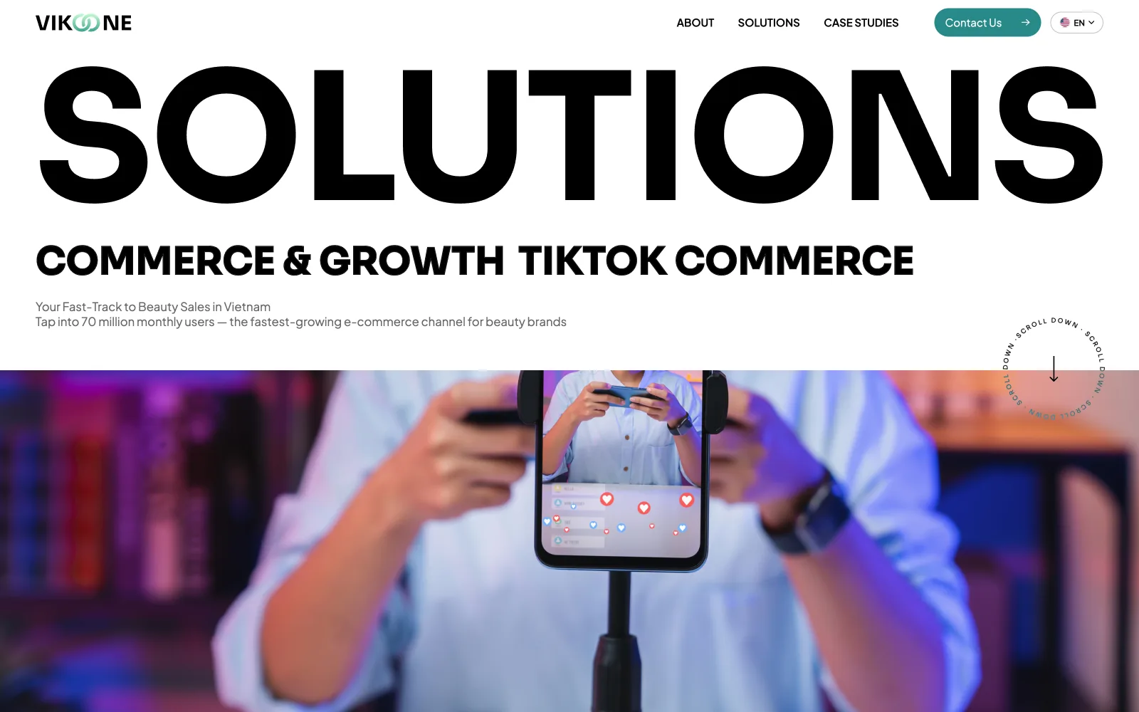
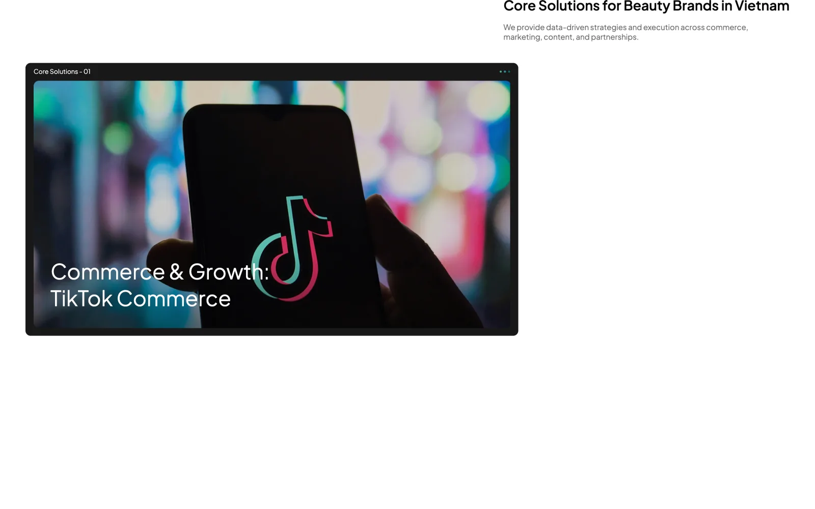
The core offering is four solutions (TikTok Commerce → MICE & B2B), and a static list would bury them. Instead each solution is a browser-framed card that flies in alternately from left and right as you scroll: the reader meets them one at a time, in order, at reading speed. It's the same trick a keynote uses: sequence as emphasis. The overview page then flips the energy: full-bleed SOLUTIONS type with four frosted-glass folders, calm where the homepage was kinetic.
Impact you watch happening
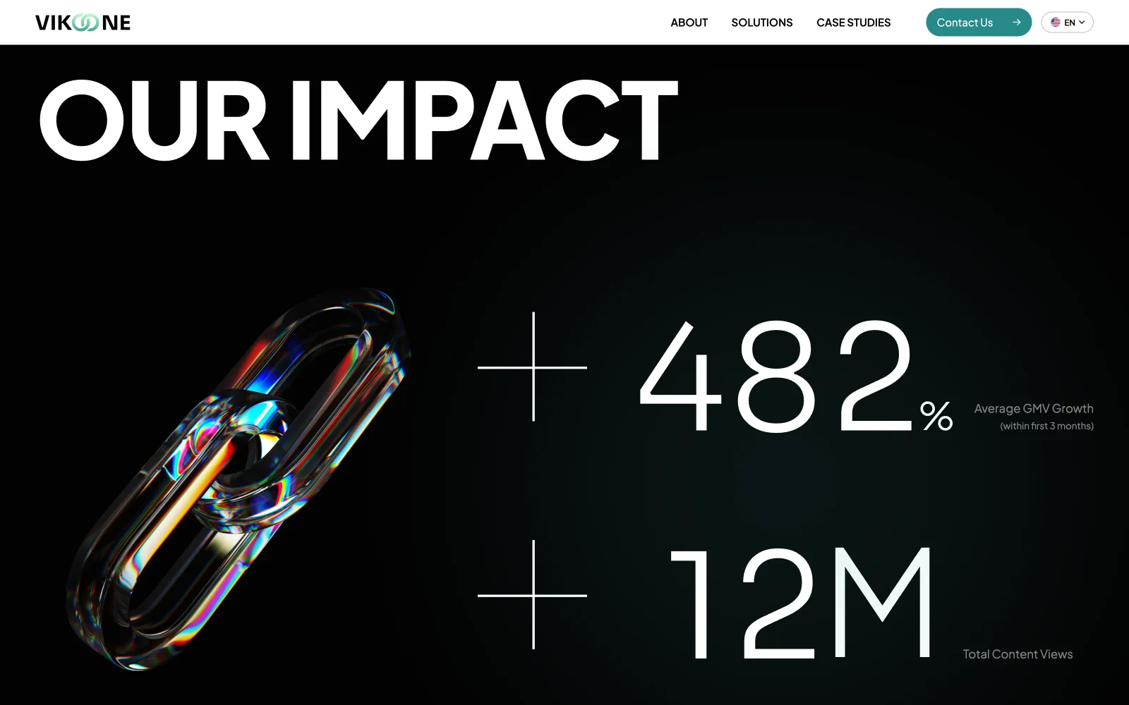
Agency claims are cheap; the OUR IMPACT section makes them physical: +482% GMV and +12M views count up from zero as the section enters, over a chrome 3D chain that reads as 'links in a funnel'. The counter isn't decoration: watching a number climb makes the magnitude legible in a way a printed figure never is. Client logos then run in a marquee underneath: motion again used as evidence, not garnish.
The identity survives a phone screen
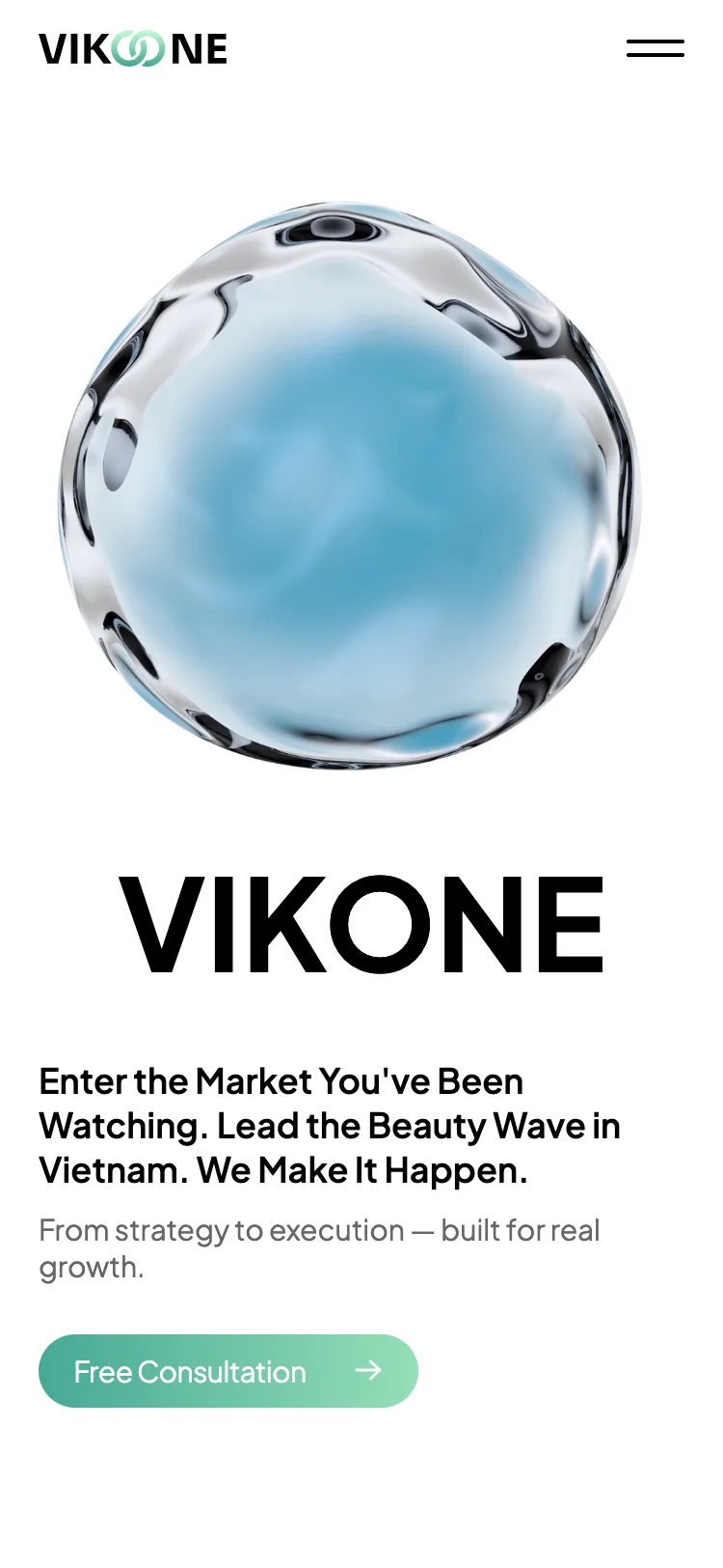
A blob-and-huge-type identity is easy at 1600px and brutal at 375. The mobile cut keeps the exact hierarchy (blob first, wordmark still oversized relative to the viewport, one CTA) instead of shrinking the desktop into a souvenir. Beauty commerce lives on phones; if the brand only worked on a designer's monitor it wouldn't be a brand.
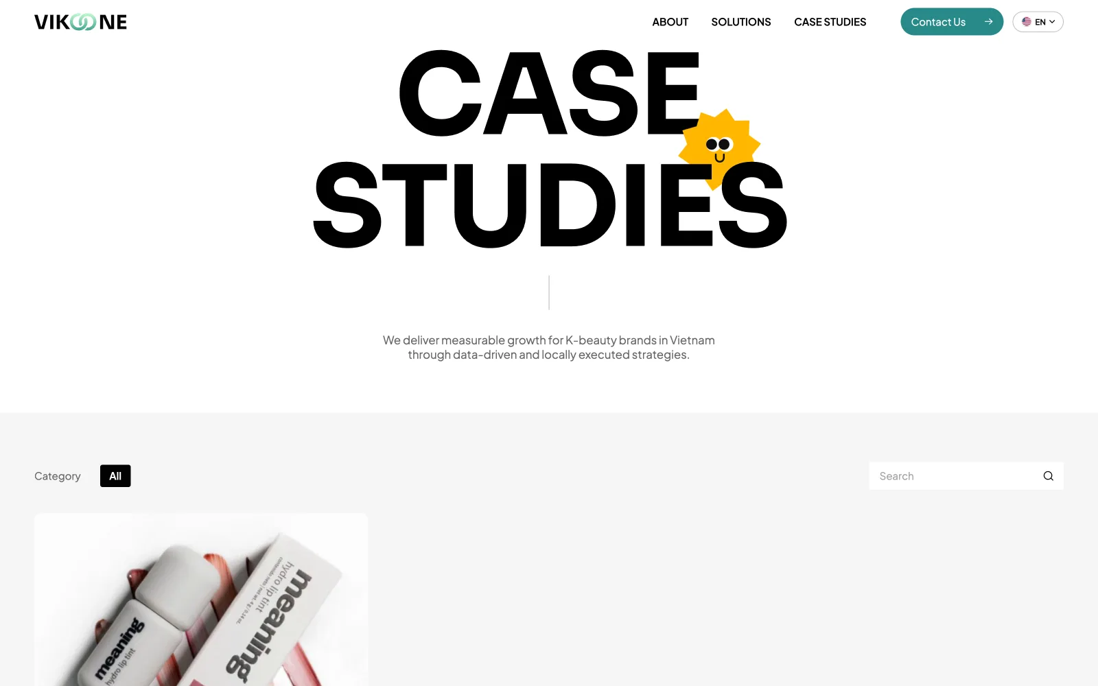
Calm pages. One thing moving.
A bold, premium first impression
A 3D hero and an oversized wordmark make a young brand feel credible enough for Korean beauty partners on first glance.
Structure the page around the value prop
'Enter the market, lead the wave' drives the layout: strategy, solutions, then proof.
 01 / 0402 / 04
 03 / 0404 / 04
- ✦A cohesive brand and live homepage ready to scale across markets.
A market-entry brand lives or dies on first impressions. Leading with a bold 3D hero and an oversized wordmark gave a young company the confidence of an established one, and building the homepage myself meant the live site matched the design exactly, not approximately.