APEX Admin — from a 190-finding audit to a quiet control room
The admin console is where the APEX platform is actually run: administrator accounts and roles, customer members, workspaces, payment history, refund review, support queues, FAQ content and announcements. It worked (every menu did its job) but it had grown screen by screen over months, and nobody had ever looked at it whole. I cloned it into a fully mocked environment where any state could be reproduced, audited all of it like a research project, distilled the findings into one design language, and then rebuilt it: seventeen redesign rounds in two days, followed by a second-pass audit of my own work. This case is as much about method as UI: how to critique a working product honestly, and how to execute at high intensity without breaking anything real.
- Role
- UX research + redesign, solo
- Timeline
- Audit + 17 rounds + re-audit · ~3 days · 2026
- Team
- Solo — handoff to VN dev team
- Scope
- Full console: 17 screens, 7 menus, auth to money ops
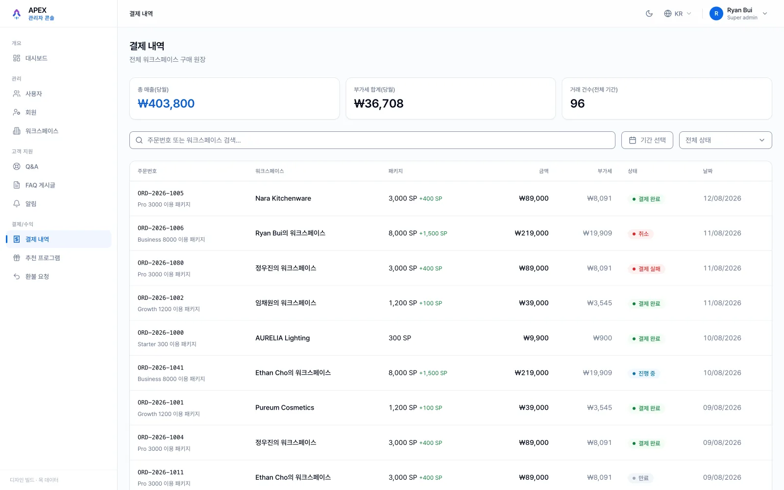
Every menu had been poured into the same 'table + detail page' mould, while the four job families it serves (monitoring, support, content, money) have completely different rhythms and risk levels. A support agent asks 'what is my work today?'; the queue answered with a sortable table. A money operator needs an audit trail; the console offered edit-in-place. And the recurring finding, in six of seven menus: plenty of power, no brakes. Admins could suspend a customer, blast a notification to every user, or delete an account with nothing between them and the mistake but a browser confirm(). The audit's job was to name these patterns precisely enough that the redesign would fix moulds, not symptoms.
~190-finding audit → redesign in 2 days
- 01
Ground truth
Product brief first: what the console is, who it serves, in what context. Personas derived from the nine permission codes; all 17 screens captured as visual evidence.
- 02
Audit through ten lenses
Ten parallel expert passes over code, i18n, data contracts and screenshots, speculation banned. ~190 findings, each with evidence and cost; five recurring moulds named.
- 03
Language before pixels
Distil the findings into 'a quiet control room' and a checkable standard (tokens, buttons, badges, motion, page anatomy) that every later screen must pass.
- 04
Primitives → pilot → spread
Validate the palette, rebuild the shared DataTable with four first-class states, prove the language on one pilot menu, then spread menu by menu, 17 rounds in two days on the mock.
- 05
Re-audit & fix
Seven fresh lenses sweep the redesigned console against its own standard; findings land as five fix batches. Handoff ships split by menu into dev-ready tasks.
Personas you can't argue with
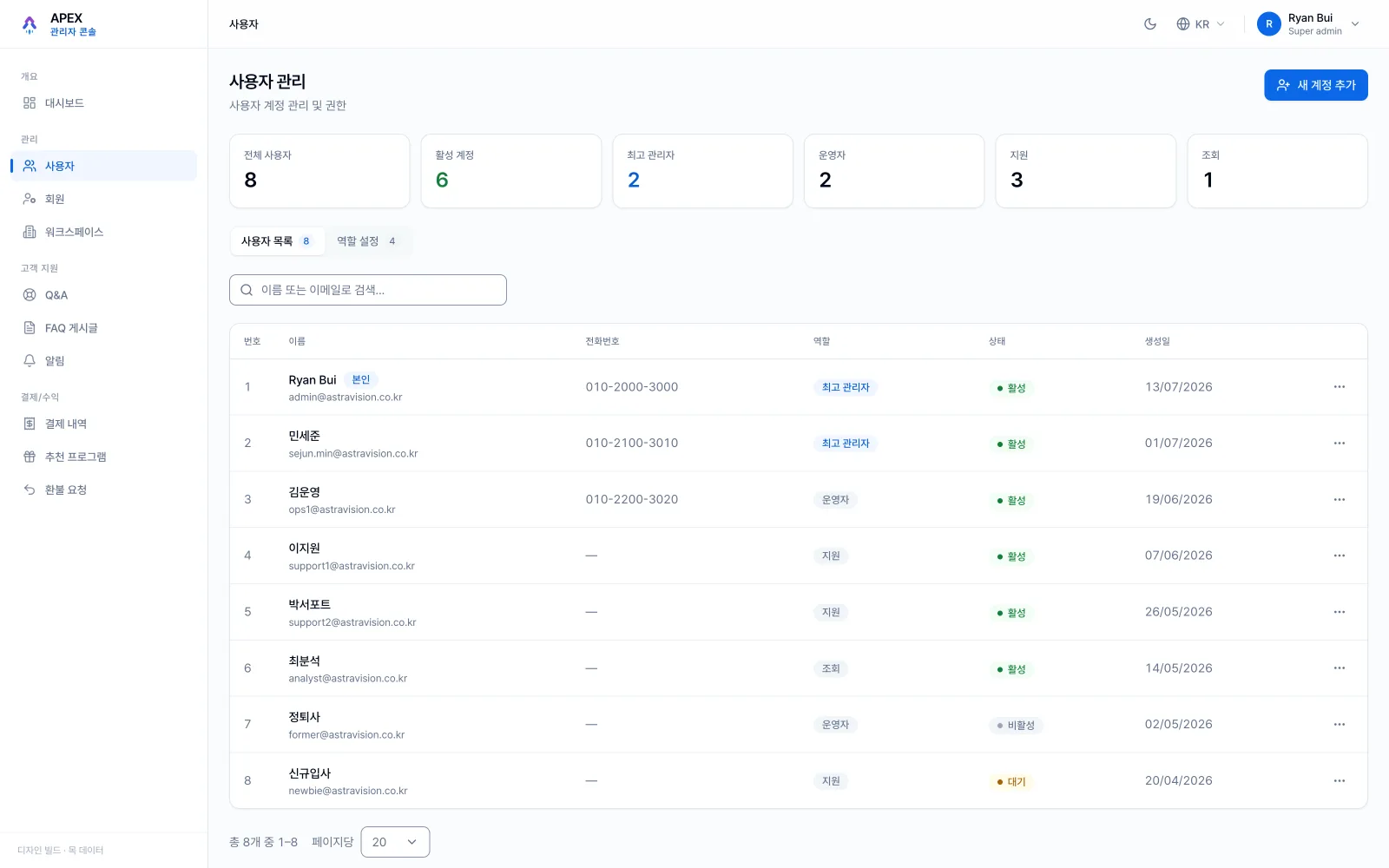
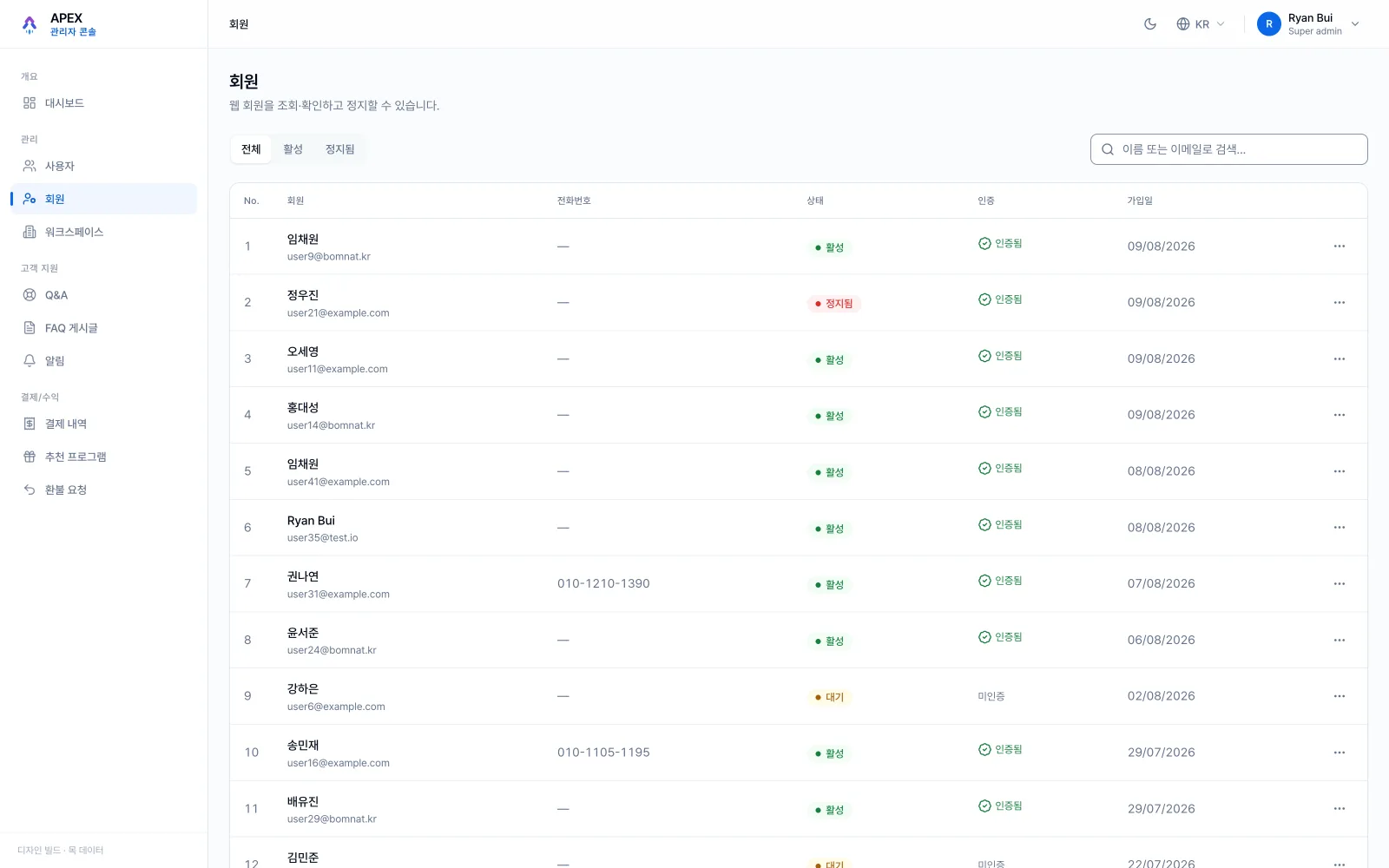
Admin tools rarely get real user research, nobody interviews the ops team that doesn't exist yet. But the permission system already encodes the truth: nine permission codes in the codebase describe exactly who is trusted to do what. From them I derived four personas: the super admin, the operator, the support agent, the read-only analyst. Each with real scope, real risk, real daily questions. Every later finding was judged from their chairs, which is why the audit could say 'the queue fails the support agent' instead of 'this table feels cluttered'. Personas built from code can't be dismissed as taste.
Plenty of power, no brakes
The audit's one-line conclusion. Suspending a customer's account, mass-notifying every user, deleting an admin, all guarded by nothing but confirm(). One menu even let an admin walk into revoking their own access. The redesign added friction proportional to blast radius: destructive actions state their consequences in plain language, irreversible ones require typing to confirm, and the refund queue (where real money leaves) got explicit review states instead of a button. The principle survived into every later screen: power without brakes isn't a feature, it's a countdown.
A dashboard that only tells countable truths
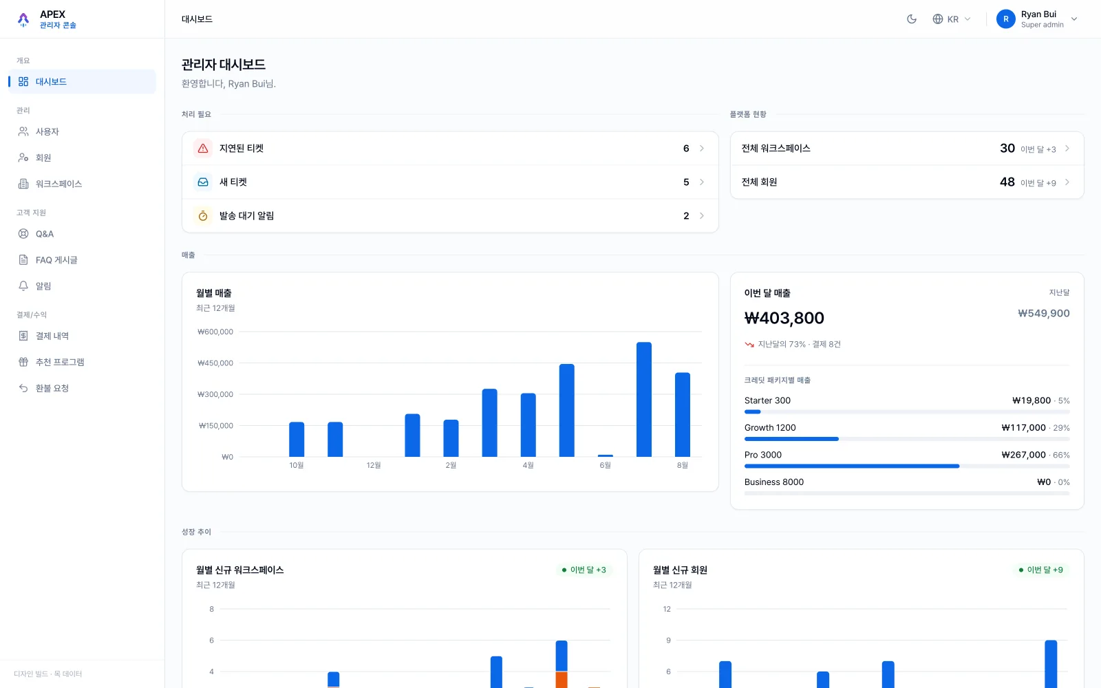
The dashboard went through three loops, and each loop deleted something. Out went vanity metrics and decorative trend arrows nobody could act on; in came a 'needs handling' block (late tickets, new tickets, pending sends) that answers the only morning question that matters: what needs me now? Charts kept real data with synced cursors; revenue got its month-over-month truth even when the truth was a decline. The rule that crystallised: an admin dashboard is a to-do list wearing charts, and every number on it must be countable, attributable and actionable.
Q&A is a ticket queue, not a chat
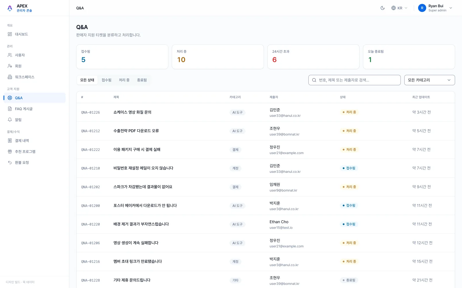
The support area was the audit's heaviest zone (35 findings on its own). Its root confusion: the UI borrowed chat metaphors for what is actually asynchronous casework. The redesign renamed the mental model (tickets, states, ownership, SLA) and rebuilt the queue around the agent's day: received / in-progress / overdue-24h / closed-today up top, one-line status per row, and a detail page that reads like a case file rather than a message thread. Same data, different grammar, and suddenly 'what is my work today?' has an answer at a glance.
Auditing my own redesign
The most uncomfortable and most valuable step: after seventeen rounds shipped, seven fresh lenses swept the redesigned console the same way the original was swept, shared-table behaviour, search debounce, URL-state, stray off-palette colours, accessibility, plus corner-hunting per area. They found what sprint momentum always hides: an inconsistent focus ring on charts, table alignments that drifted, a trend chart quietly using placeholder data. Five fix batches later, the redesign finally passed its own standard. A design language you won't re-audit yourself against is a poster, not a standard.
The audit was clean — against the wrong branch
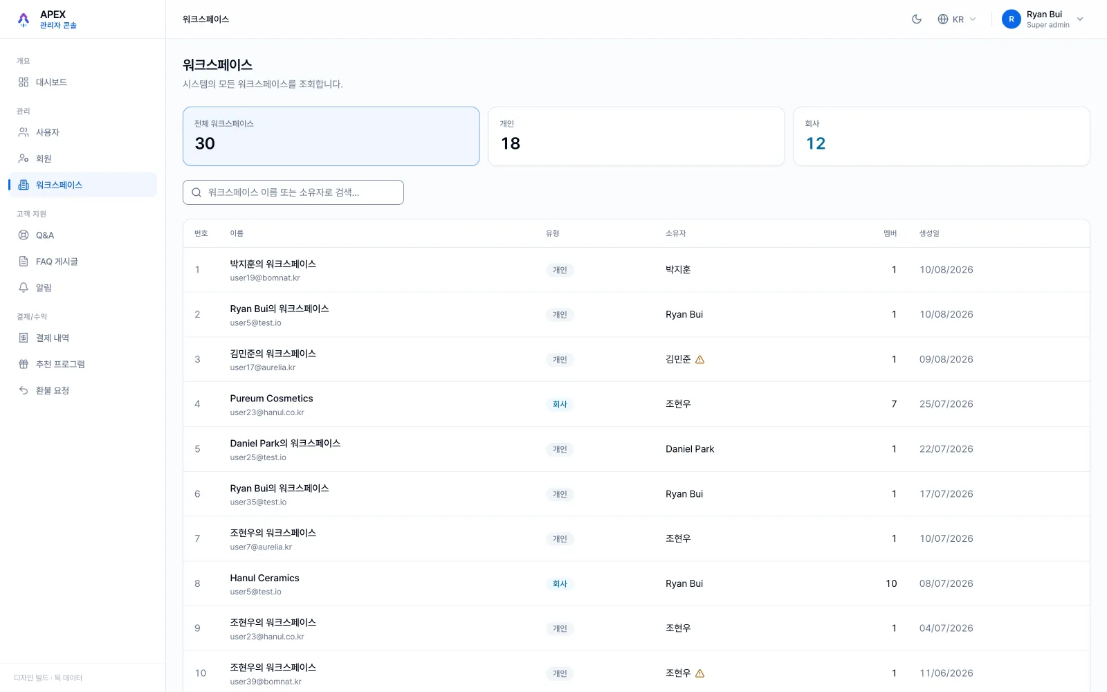
Halfway through, a quiet mismatch surfaced: my design clone had been taken from the stable branch while the engineers had moved on, thirteen commits and forty-seven files ahead. Every finding I'd written was still true about a product nobody was building any more. Re-syncing first cost half a day and saved the whole audit. It also changed how the work was packaged. Anything my redesign changed on purpose went into a short 'intentional drift' list: proposals from design, with the dev team deciding case by case what to take. Screens that needed data nobody had exposed yet shipped with a table of the exact endpoints and fields they were waiting on, plus the blunt note that without them the screen renders empty. Reviewers got a running environment where the account you typed decided which of the four admin roles you saw, so nobody had to imagine a permission level. And after an earlier incident where states were missed in a build, every handoff carried its acceptance cases and a live link to the sandbox: pasted straight into the ticket, so 'done' meant the same thing to design, dev and QA. Colleague review rounds pushed back too: the revenue card only stopped changing when a reviewer's comments talked me out of the chart and into plain typography.
Light by decision — dark almost for free
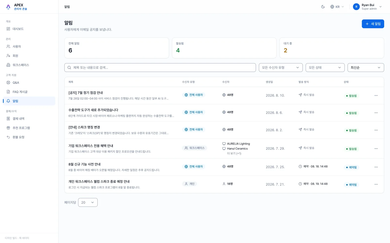
The console defaults to light on purpose: an ops room reads faster on paper-calm surfaces, and that reasoning is written down in the codebase. But because every colour rides the same semantic tokens, the dark skin resolves from the exact same components, no dark: classes anywhere, one variable block flips the whole console. Drag to compare.
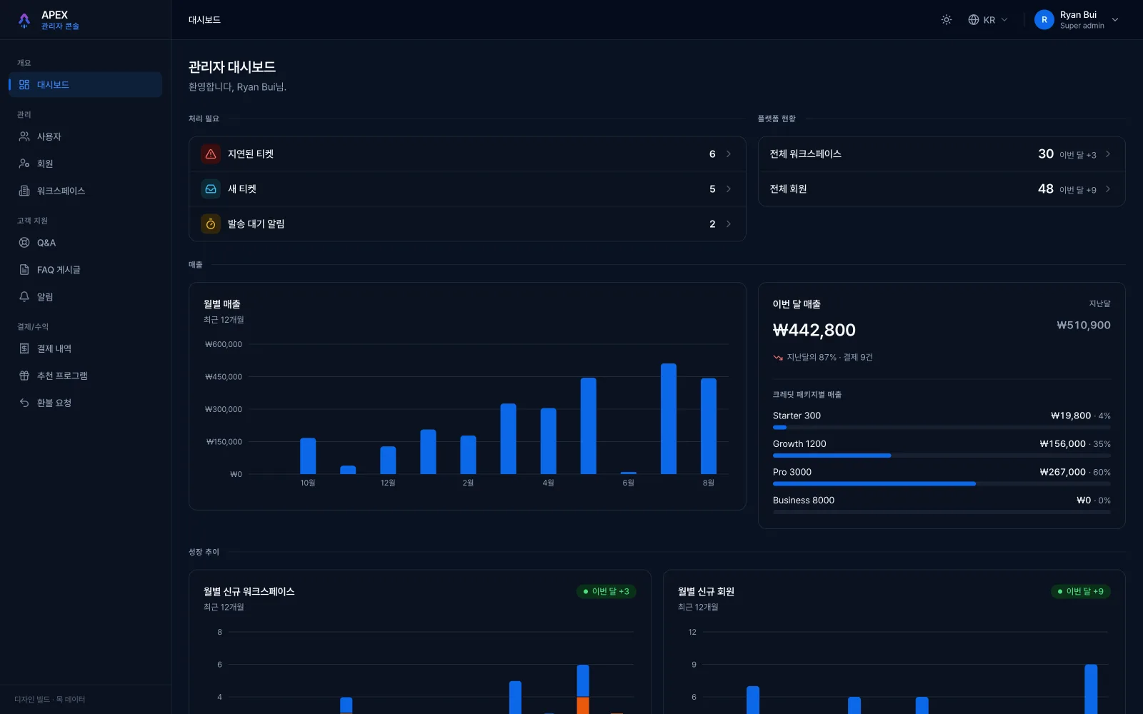
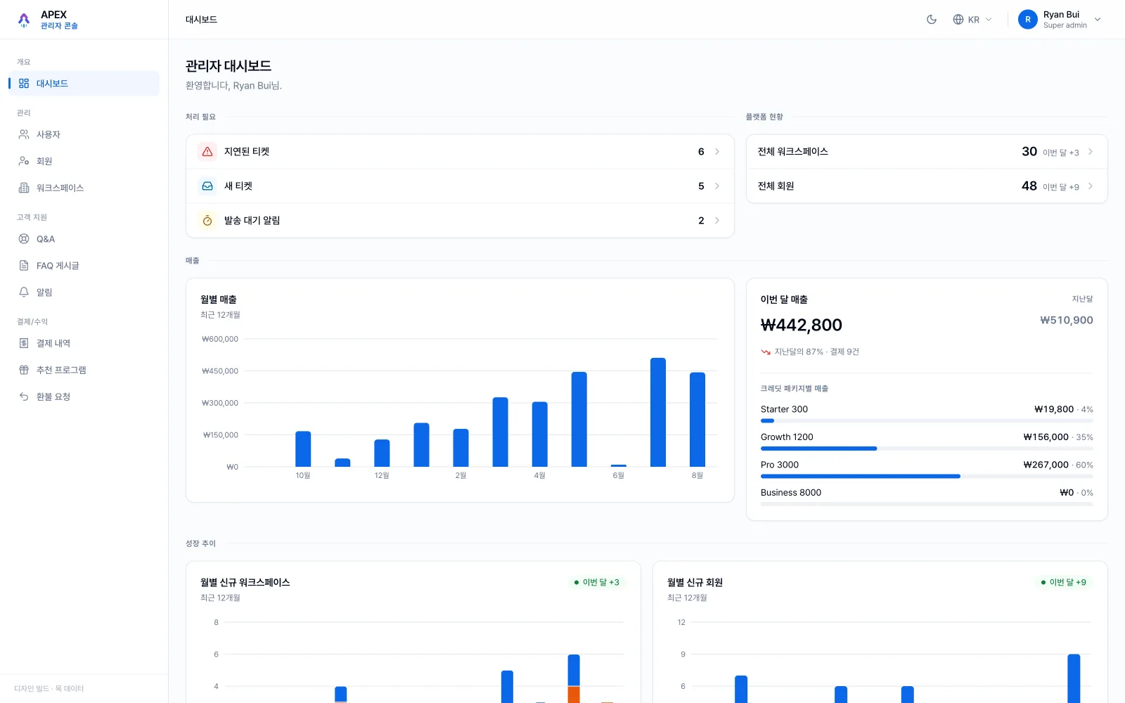
Dashboard · drag the divider
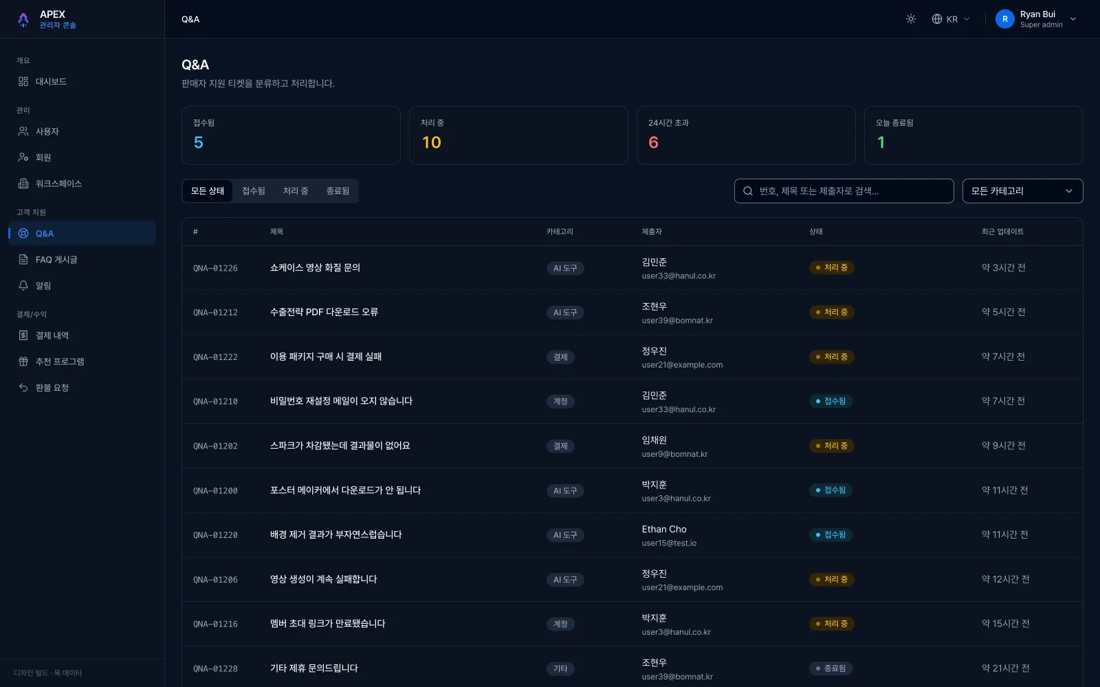
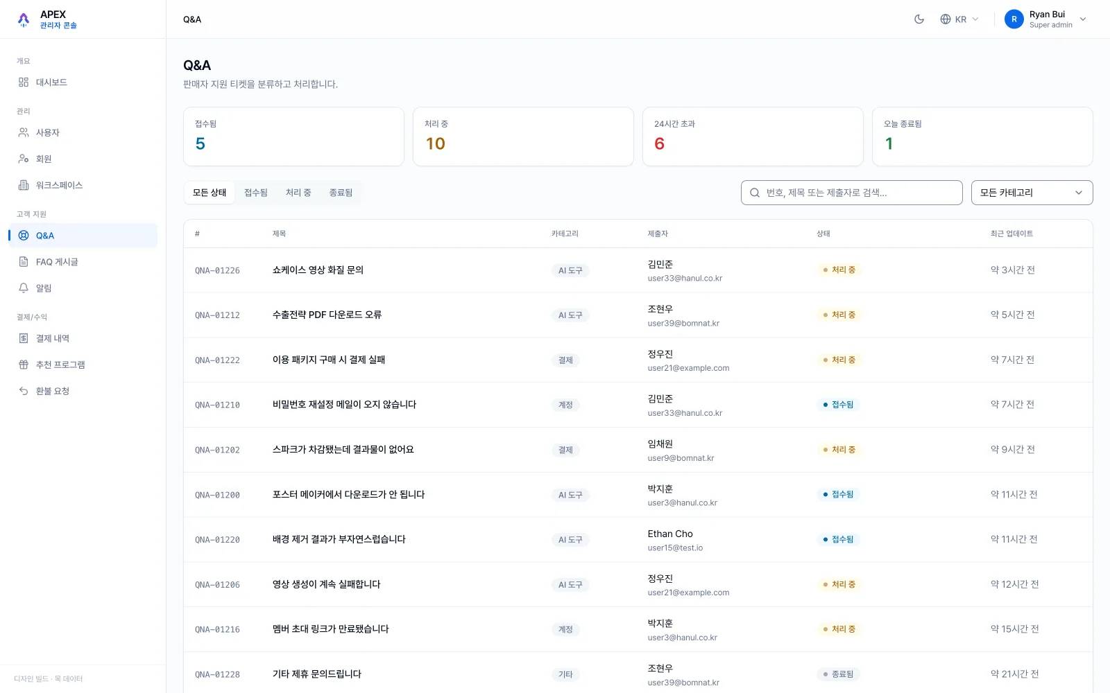
Q&A queue · drag the divider
Plenty of power. No brakes.
Audit before language before pixels
The design language was earned from the findings, not imposed on them. Which is why seventeen rounds later it still held.
Light mode, on purpose
An ops room reads faster on calm, paper-like surfaces, so the console is light by decision, not by OS default, and the reasoning is written down where the next designer will find it.
Brakes proportional to blast radius
Suspend, mass-notify, delete, each destructive power now carries friction sized to its consequences, replacing bare browser confirms.
Same primitives, different rhythms
The four job families share tokens and tables, but each screen now opens with the question its operator actually asks: a queue leads with 'my work today', money leads with the audit trail.
Intensity only on a mock
Seventeen rounds in two days is reckless on production and safe on a full mock. The sandbox is what converts speed from a risk into a tool. No real customer was ever behind the glass.
 01 / 0602 / 06
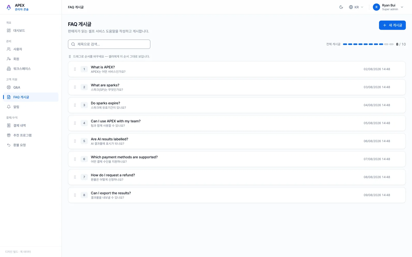 03 / 0604 / 0605 / 06
- ✦~190 evidence-backed findings distilled into one written standard; 17 redesign rounds shipped in two days; a second-pass re-audit with seven fresh lenses and five fix batches before handoff.
- ✦A console with brakes: destructive power now carries friction proportional to consequences, and the money surfaces expose explicit review states and audit trails.
- ✦Handoff split by menu into dev-ready tasks on a mock that mirrors the real API, the dev team clicks through exact target states instead of reading prose.
The audit's one-line conclusion ('plenty of power, no brakes') did more for the redesign than any individual finding, because a sentence the whole team can repeat is a standard that enforces itself. The other lesson was humbler: the re-audit of my own work found real defects, and it stung, and it should. Method is what remains when the screens are handed off: personas from permission codes, findings with evidence, language before pixels, and never trusting 'done' without a sweep that proves it.