KOTRA AITC — the national AI export programme
APEX is the platform behind KOTRA's AI Trade Support Centers (AITC), a nationwide programme that helps Korean SMEs become exporters. It spans three surfaces: a public landing where an SME picks one of 7 regional centres and books free services (BuyKorea product registration, product photography, space rental); a back office that runs the centres' schedules, visitors, companies and inquiries; and a suite of AI tools, background removal, concept-image and video generation, product pages and export-strategy creation, powered by GPT-4 and Claude.
- Role
- UI/UX · Front-End
- Timeline
- 2024 — Present
- Team
- Astra Technology — for KOTRA
- Scope
- Public landing + back-office + SME AI tools
Traditional export support is fragmented: associations give information, B2B platforms give buyer lists, agencies cost a fortune, consultants hand over a strategy and leave the doing to you. APEX had to fold all of that into one place: strategy and execution, content and matchmaking, for SMEs with little or no export experience, and make a government-grade programme feel approachable.
KOTRA · national AI export platform
- 01
Map the workflow
Broke the multi-stakeholder export process into clear, sequential stages.
- 02
Design
Built the screens on the shared Astra system so the product family stays consistent.
- 03
Build
Took it into front-end code as a working, navigable product.
Seven centres, one first decision
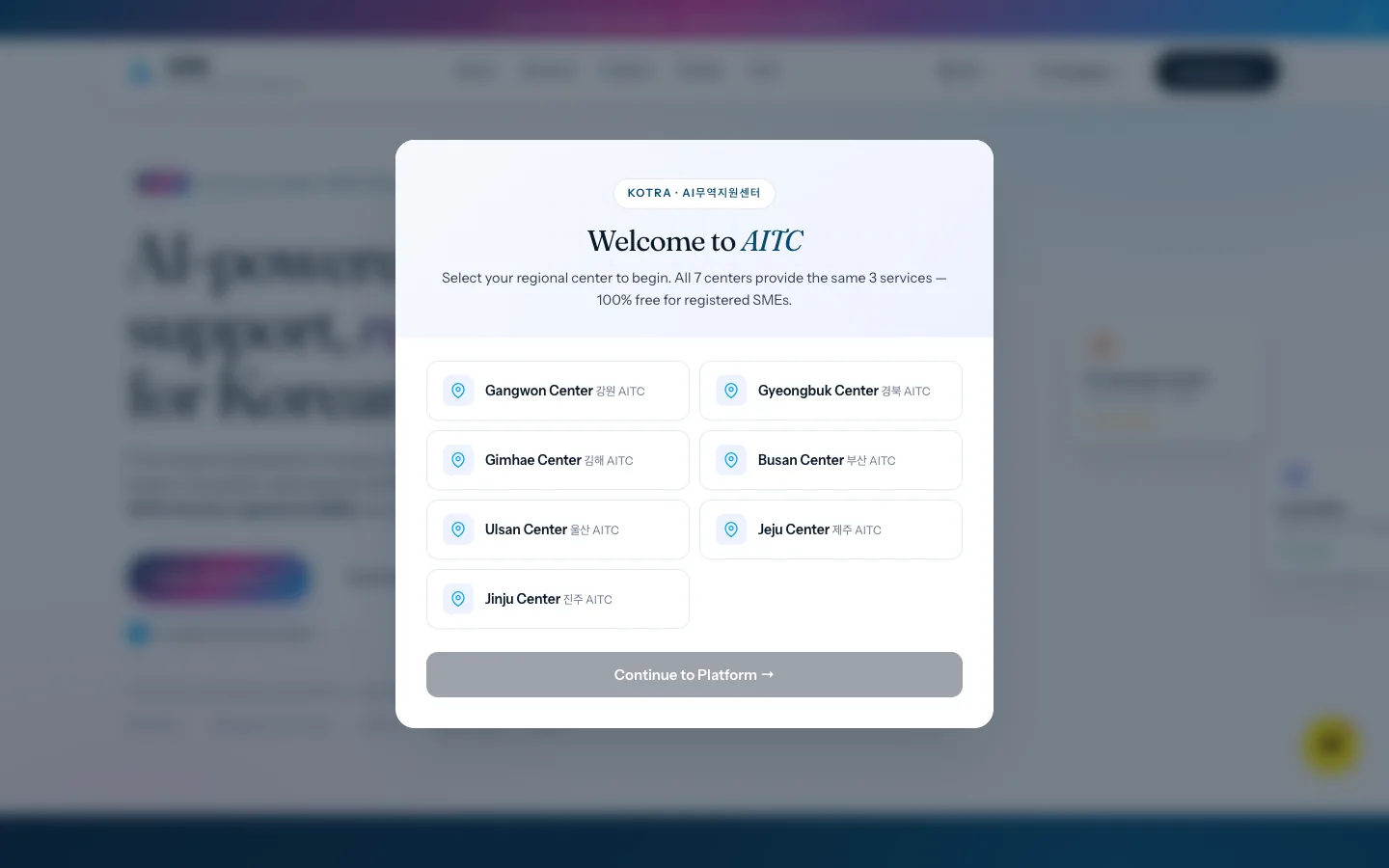
A nationwide programme's landing could open a hundred ways; AITC opens with a single question. Which regional centre are you? The welcome modal lists all seven, each Korean name beside its English one, and states the deal in one line: the same three services everywhere, 100% free for registered SMEs. That first decision does quiet routing work. Every SME lands in its own region's context before reading anything else. I designed this surface and then built it into the live landing myself, so the 7-centre selector behaves exactly the way the Figma promised.
A back office that answers in one glance
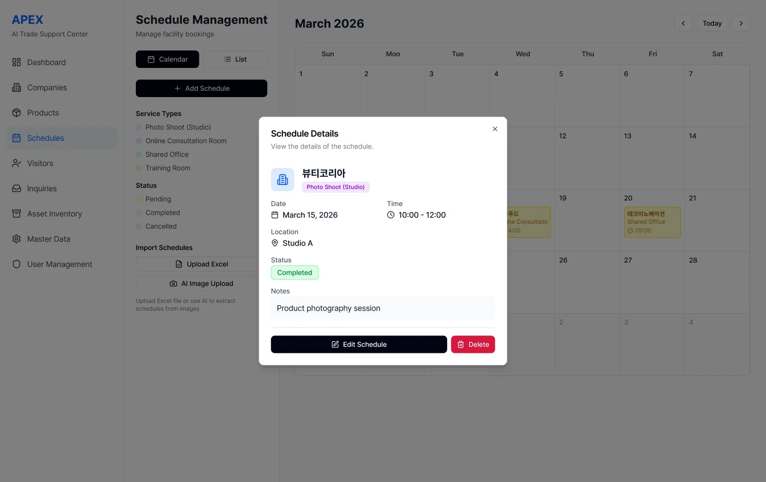
The centres run on bookings, photo-shoot studios, consultation rooms, shared offices, training rooms, and the staff's real question is always the same: what's happening, where, in what state? Scheduling ships in both calendar and list views under one left rail of modules, with service types and statuses acting as a persistent legend. Clicking any slot opens a detail modal that answers everything at once (company, service, date, time, location, status, notes) then offers exactly two actions. Status colour runs through the whole surface, so a month of operations reads like a weather map.
The fastest form is the one you don't fill
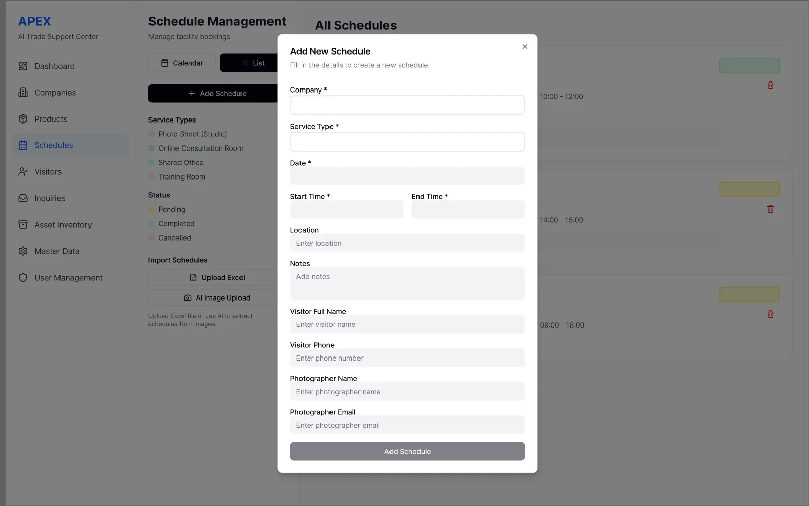
One booking is a clean form: company, service type, date and times required first, visitor and photographer details following in strict order. But centre staff don't receive bookings one at a time; they receive spreadsheets and, often, photographed printouts. So the add-schedule modal keeps single entry light and honest, while the sidebar carries the escape hatches: import from Excel, or hand an image to AI and let it extract the schedule. Designing both lanes side by side respects how government-adjacent operations actually work (paper first, system second) instead of pretending everyone starts digital.
Tools in a sequence, not a pile
The SME-facing suite covers background removal, concept images and video, product pages and an export strategy, powered by GPT-4 and Claude. Could easily have shipped as a wall of tools. The design decision that mattered was refusing that: an SME with no export experience gets one guided sequence that mirrors the real journey, from cleaning up product photos to holding a strategy document, each tool arriving when the workflow needs it. It's the same conviction as the rest of APEX: a government-grade programme should feel like a path someone walks you down, not a warehouse you're left to search.
One guided path, not a wall of tools
Exporters get a single sequence to follow rather than a dashboard of disconnected features: less overwhelm, faster completion.
Reuse the FECT system
Sharing one design language across APEX and FECT meant a consistent product family and far less rework.
01 / 0302 / 03- ✦A complete, navigable export workspace — design through to live front-end.
Designing for a government programme meant making something rigorous feel effortless, an SME with no export experience should never feel the bureaucracy underneath. Building the public landing in code myself kept the vision intact, from the Figma comp to the live 7-centre selector.