APEX Seller — designing a paid product under Korean law
APEX Seller is the commercial evolution of the APEX platform, a paid AI workspace where Korean sellers buy usage packs (Sparks) and run nine AI tools, from background removal and concept imagery to product catalogs and a full export strategy. For twelve weeks and ~450 commits I owned the design end to end: the public landing, the entire pricing and billing experience, onboarding and referral, transactional email, and the design system underneath, and I shipped all of it to the dev team as working front-end code, not static mocks. What makes this project worth telling is not the screens; it's what shaped them. In Korea, a paid product is a legal object: how you display a price, how you word a refund, even what you call your credits. Each is regulated, and each regulation arrived mid-flight and collided with something already built.
- Role
- UI/UX Designer — design through working code
- Timeline
- 12 weeks · ~450 commits · 2026
- Team
- Solo design · VN dev team · Korean market
- Scope
- Landing · pricing & billing · 9 AI tools · design system · email
Turning an internal-grade toolset into a product that charges money in Korea means the hard problems aren't visual. Consumer price display must include VAT. Refund flows are regulated down to the order of steps. Every piece of AI-generated output must be labelled by law. A payments compliance review can reclassify your entire product over a single everyday word. Meanwhile the product itself kept moving: the pricing model changed three times (subscription → one-shot packs → a seven-tier lineup), the BA delivered legal copy that had to ship verbatim, and a dev team was waiting on handoffs that had to be exact. There was no PM in between. Every constraint landed directly on the design desk, usually mid-sprint, usually contradicting something already built. The real brief became: build a design practice that survives constant collision.
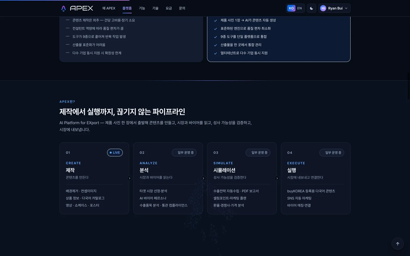
Commercial SaaS · Korean market

- 01
Inherit & separate
Split the commercial product cleanly from its internal sibling: its own design system, its own vocabulary, no borrowed credibility from the ecosystem it grew out of.
- 02
Build the fake world first
Stand up the sandbox (100% mocked backend, every state reachable) so that design, review and handoff all run against the same living build.
- 03
Absorb constraints at the right layer
Each legal or market requirement was traced to the layer it actually affects (data, display, or copy) before anything got redrawn. VAT lived in display; wording lived in values; refund order lived in flow.
- 04
Ship in rounds
Every batch shipped as a self-contained round: final code, changelog, clickable cases as definition of done. A file appearing in many rounds is the same final build in all of them.
- 05
Precipitate rules from incidents
Every real incident became a written rule (seventeen of them by the end) so the same mistake can't happen twice. Process here wasn't designed up front; it crystallised.
One everyday word nearly reclassified the product
A payments compliance review flagged that the word we used for credits could legally classify APEX as a prepaid instrument, a completely different regulatory regime with hard purchase caps. The fix was a product-wide renaming (Sparks was born), executed under one iron rule: only display values change, never identifiers, keys or APIs. The icon followed the word, coin became bolt. Lesson: in this market, vocabulary is a legal surface, and a designer has to read that risk before drawing.
Six failures, then the brief itself was wrong
Bronze → Black needed identity marks. Lucide icon mashups, hand-drawn medals, stacking blocks, thin monochrome linework, layered solids, even a set of animated WebP gems: six directions died six different deaths ('too childish', 'wrong language', 'a sticker next to our icons'). The seventh insight was that no image could satisfy the brief; the brief was over-constrained. So the job was split: typography carries the prestige (engraved uppercase, max contrast), colour carries the rank (a small rotated gem per tier). A metallic glint sweeps the name on hover, looping with an invisible seam. Lesson: when you fail the same way repeatedly, stop iterating and re-read the problem.
Change the display, never the contract
Korean price-display law requires consumer prices to include VAT, and the team chose to apply it to everyone for honesty's sake. The architectural decision: stored prices stay net (matching the BA's tables and the backend), and all VAT math lives in one display-layer helper. Not a single schema or API changed, and the number on the card finally equals the checkout total. Killing the 'why did it get more expensive?' moment. The same battle forced a number diet: cards went from eight figures to three, and every label around the price was re-swept so nothing whispered 'plus tax' anymore.
Seven cursors died; the eighth wasn't a cursor
The landing wanted a signature cursor. Dot-and-ring, gradient arrow, gem, target-lock brackets, AI star with dust, a blend-mode orb (which turned into 'a black blob' on light sections (a one-background demo is a lying demo), a crystal) seven DOM generations, all carrying the same original sin: a DOM element chasing the mouse is never the mouse. The turn came from a plain-language wish: 'default-arrow size, but our logo'. That sentence points at the platform: CSS cursor:url(). The OS draws it: zero JS, zero lag, perfect stick. The mark tilts -22° so the tip aims like a real arrow, with a macOS-style sticker outline, and hovering anything clickable swaps in a flame variant. Lesson: three same-shaped failures means the solution lives at another layer, ask what the platform already provides before attempt number four.
A one-line brief, misread twice
'700 SP, 100 a day, over 7 days.' I read it as a 7-day window and refactored the model. Correction one: not consecutive, 7 grants. I started tearing the window out. Correction two: the 30-day expiry stays. The original model had been right all along; only one constant needed to change. The refactor was thrown away. What survived is a rule I now apply to every rule-brief: pin down all three variables (total, cadence, expiry) before touching code; a 30-second question is cheaper than a discarded refactor. The silver lining: because every number flowed from constants, the UI updated itself, the progress pips literally re-counted on their own.
Why we built an entire fake world
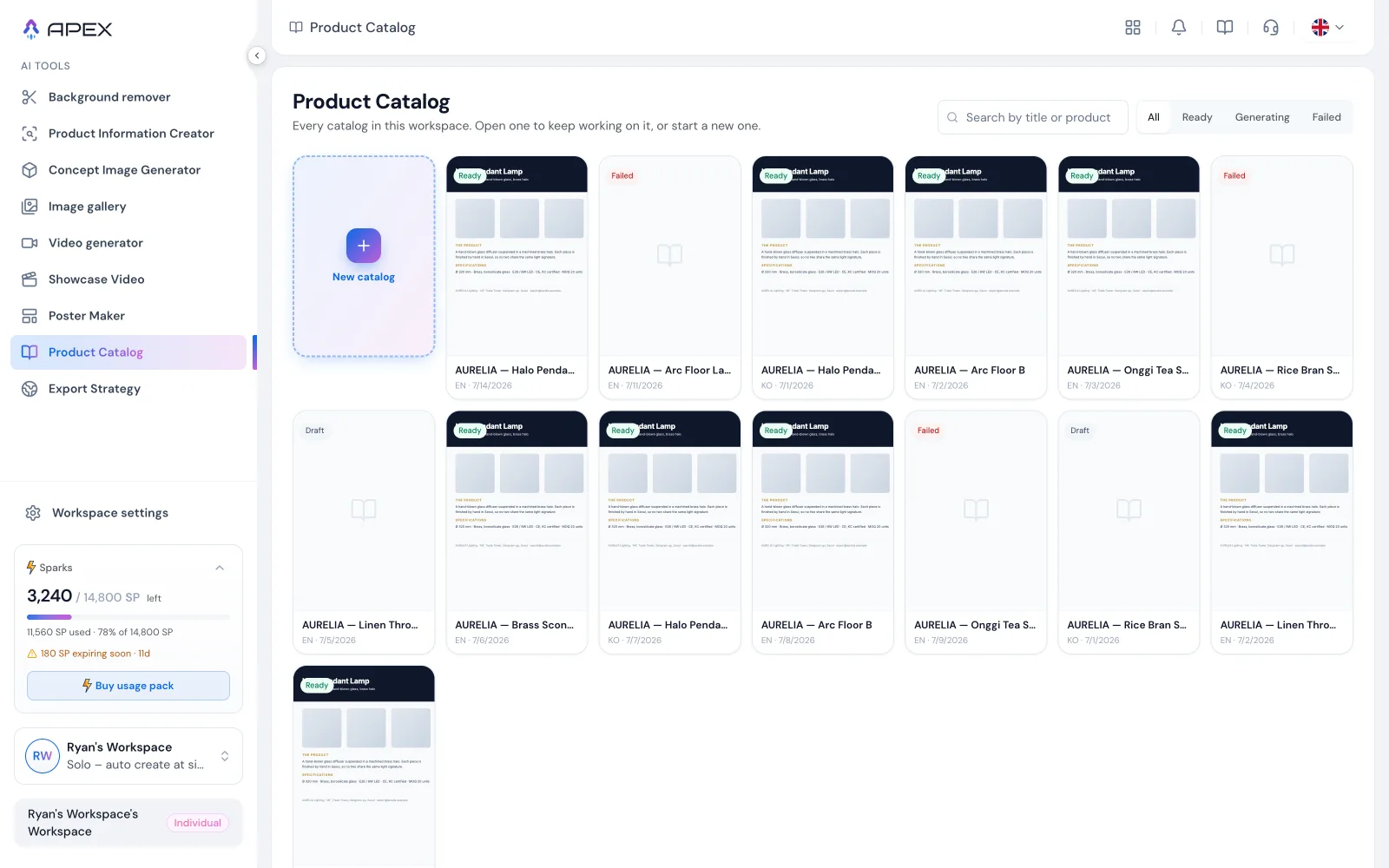
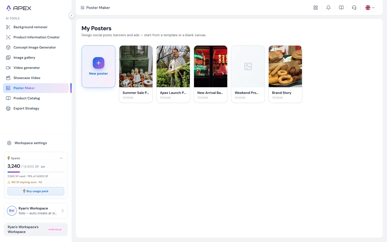
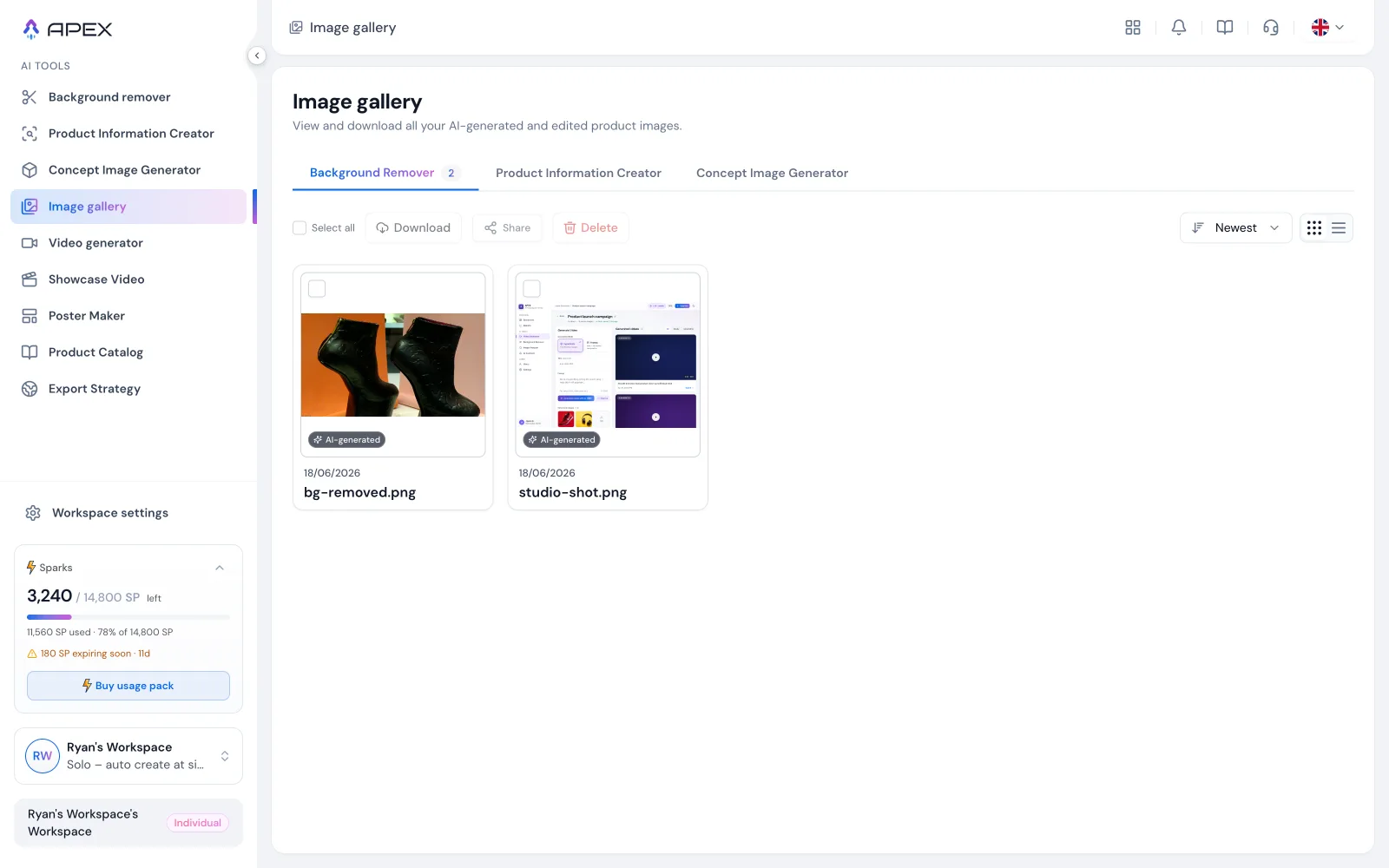
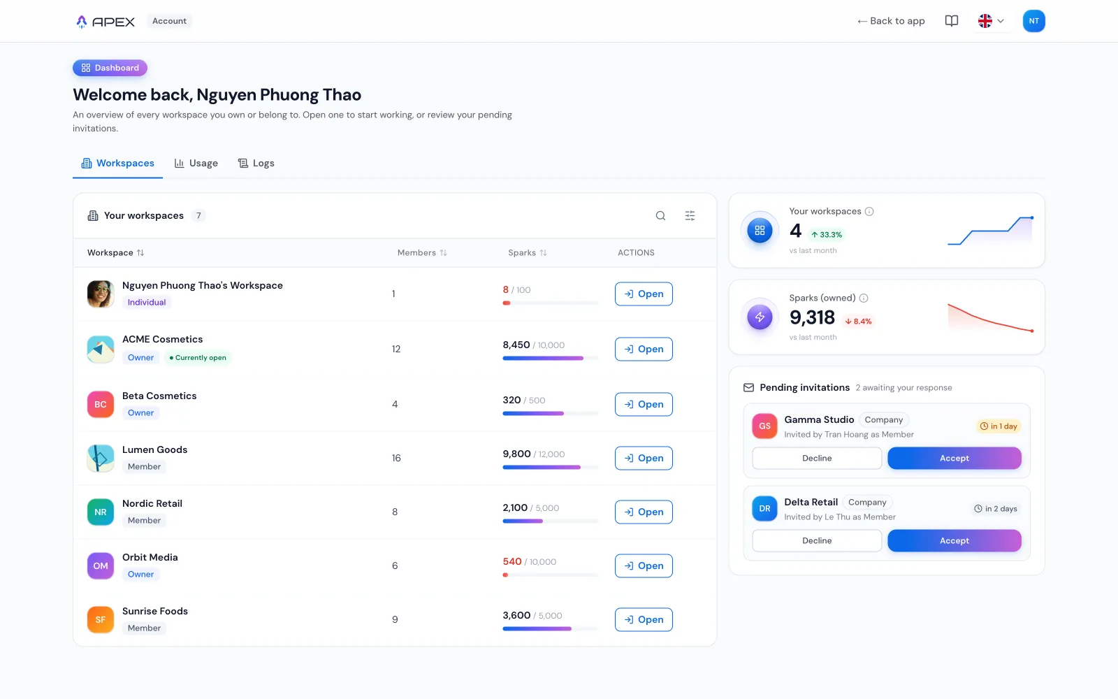
The single highest-leverage build of the project wasn't a screen. It was the design sandbox: the whole product running on a 100% mocked backend, with every persona and data state one click away. Owner healthy / expiring / low balance / empty, member view-only; data Ready / Loading / Error; refund eligibility full / partial / ineligible; EN and KO side by side. It exists for four reasons. Review needs no backend: anyone can open a state, not imagine it. Edge states get designed, because a state you can't reach is a state you'll ship broken. The state list doubles as the definition of done. Dev receives cases they can literally click through. And stakeholders preview the real thing, not a slideshow. The sandbox is why intense redesign sprints were safe: no real customer was ever behind the glass.
Designing so the dev team never has to redo their work
Shipping as code only helps if it lands in someone else's codebase without a fight. Every round went out as a self-contained folder with a README (read the round, not my whole app; not a pull request) so the engineers stayed in control of their own repo. One tool I redesigned had already been built by a developer: I rebuilt the interface on the exact same back-end contract, leaving every API, stream and hook signature untouched, and wrote the note that mattered, 'if you already have your own layout, change the one overflow class, don't overwrite the file'. Another round removed four features because the dev team said they weren't porting them; a celebration effect got hand-written in about sixty lines rather than pulling in a dependency that would force everyone else to install it. Copy under legal review shipped with a hard rule I inherited and enforced: change the displayed value, never the identifier, key or API behind it. And when the Korean side flagged that an amber bonus badge reads as taboo and as 'discount' in their market, the whole scale moved to green the same day. None of that is glamorous; all of it is why the handoff stuck.
The same pixels, resolved twice
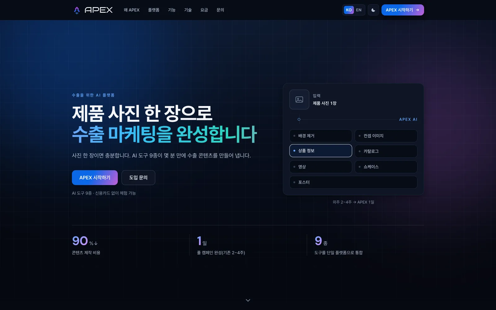
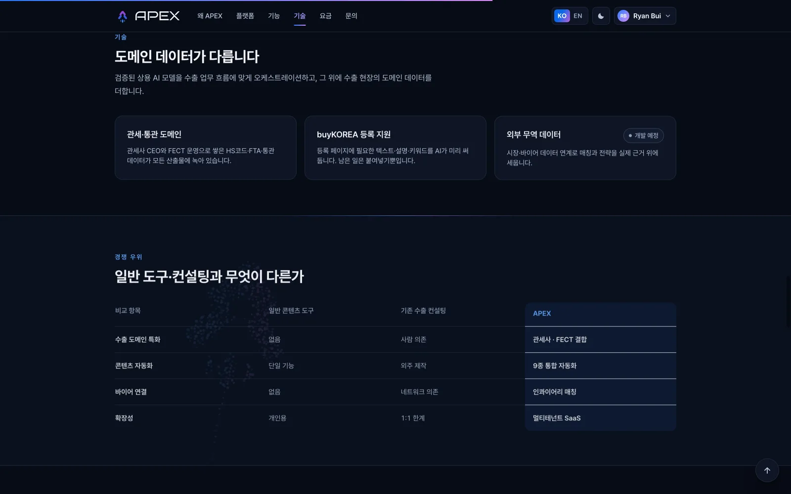
The landing ships both light and dark from one semantic token system, no component knows which mode it's in; every colour resolves through the same variables. Drag the divider: hierarchy, contrast and the aurora accent all survive the swap.
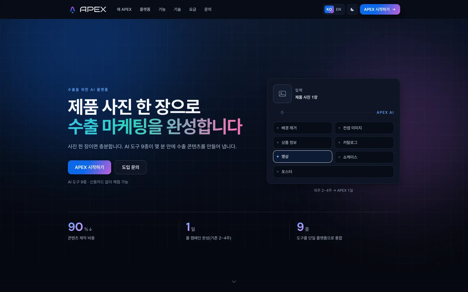

Hero · drag the divider
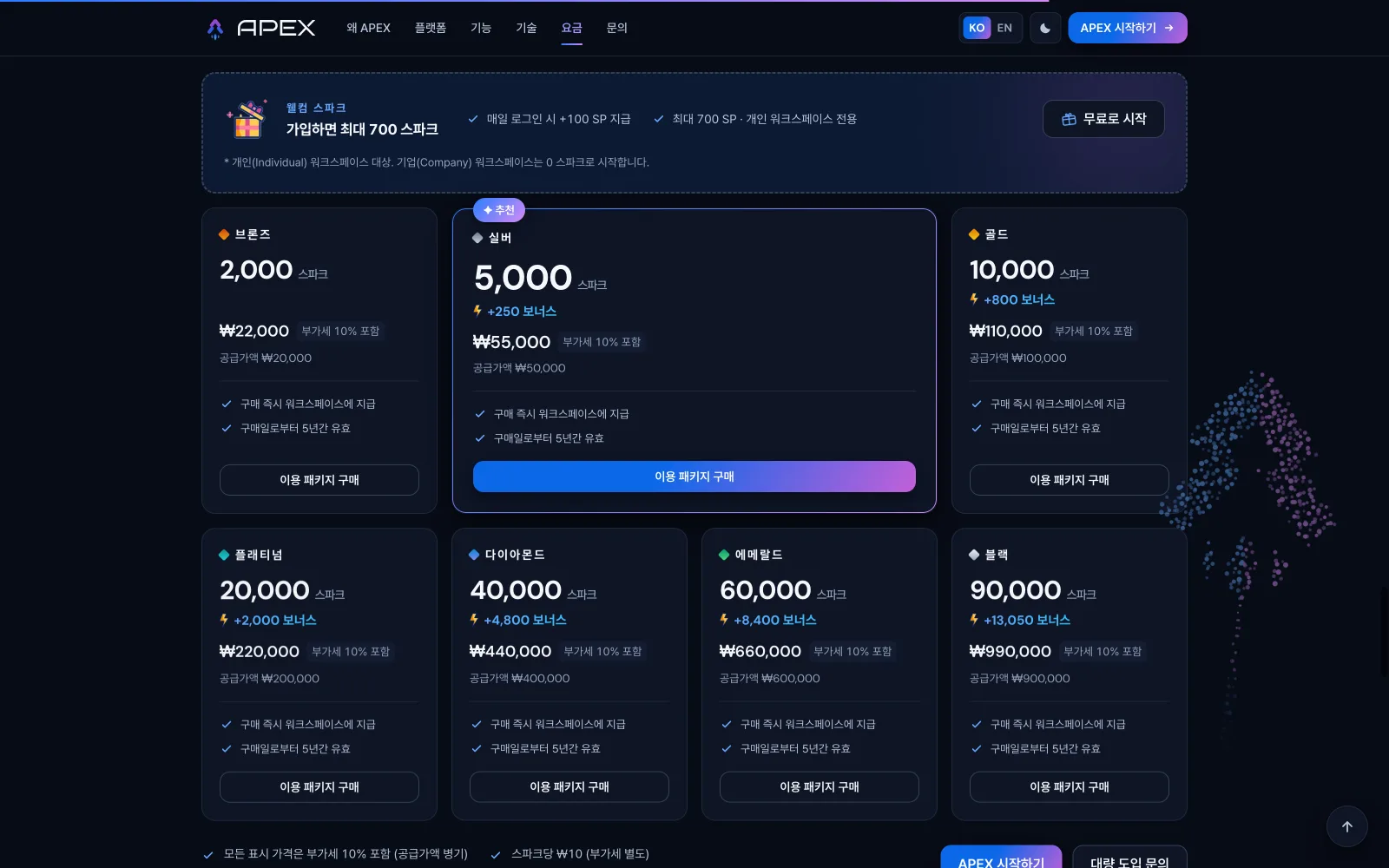
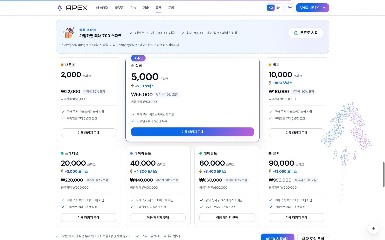
Pricing — Bronze → Black · drag the divider
Every screen, every state, provable.
Change the display, not the contract
When price display had to include VAT, stored prices stayed net and all math moved to the render layer: zero schema or API changes, and the card finally matches checkout.
Words are a legal surface
A compliance review showed one everyday word could pull the product into a stricter regulatory category. The entire vocabulary was renamed: changing only display values, never identifiers or APIs.
Fail three times the same way? Change layers
Seven cursor generations and six tier-icon directions taught the same rule: repeated same-shaped failure means the problem statement is wrong, not the drawing. Ask what the platform provides before attempt four.
No invented facts — anywhere
A 'Most popular' ribbon whose data died with the old catalog was removed, not transplanted. A CTA implying a nonexistent volume-pricing table was renamed. When a real fact is unknown, the design says so. It never guesses.
'Done' must be provable
After once declaring a sweep 'checked carefully' while a table sat unopened in my own grep results, the answer format changed: every 'done' now ships with the command that proves it, and sweeps run by criterion, not by memory of files touched.
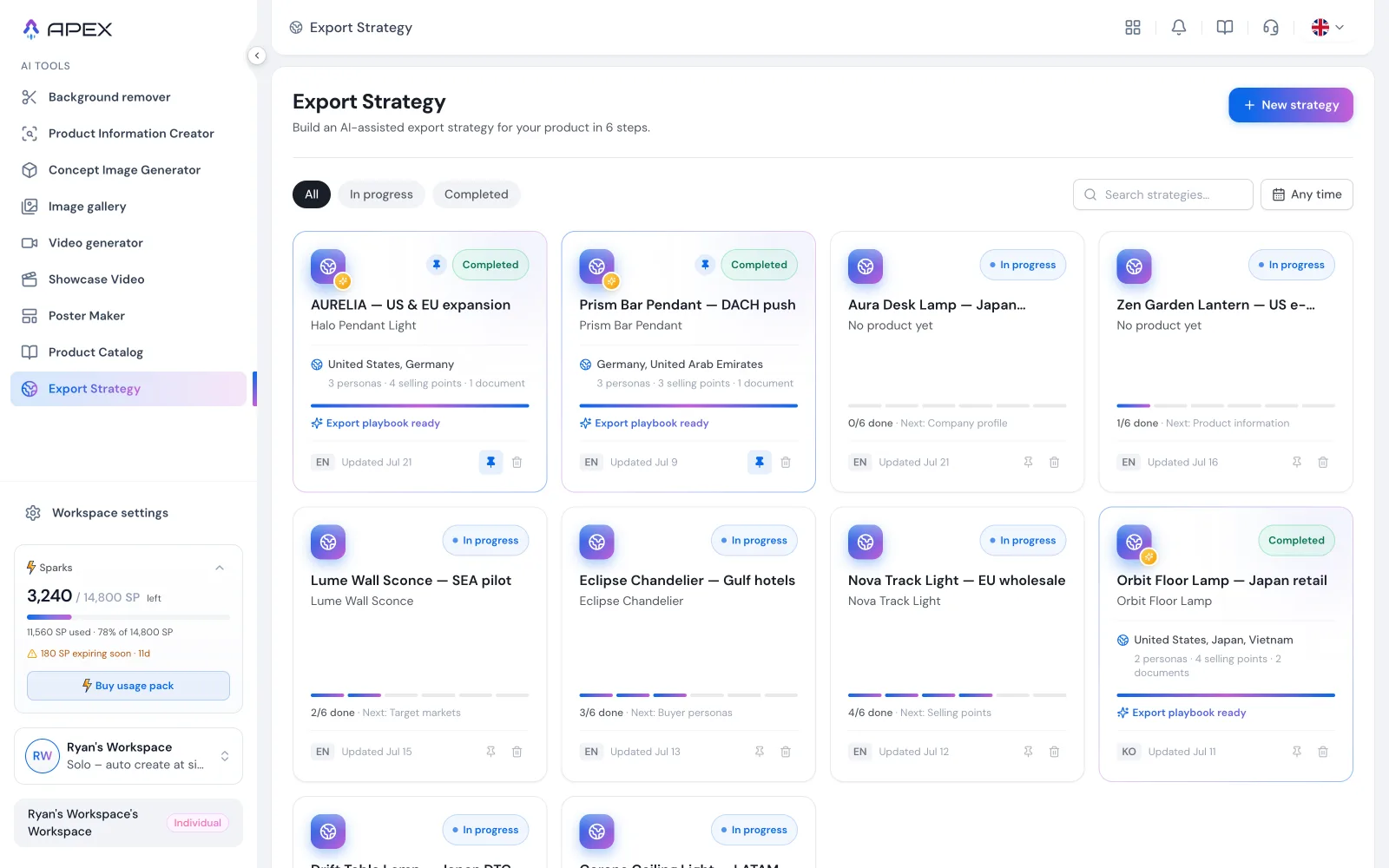 01 / 0702 / 07
 03 / 07
 04 / 07
 05 / 07
 06 / 07
- ✦Twelve weeks, ~450 commits: landing, the full pricing & billing experience, nine AI tools, onboarding, referral and the email system, delivered to the dev team as final code in self-contained handoff rounds.
- ✦A design sandbox that doubles as living documentation: every persona, data state and edge case one click away, review, QA and handoff all run on it.
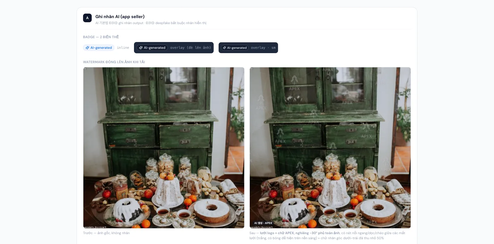
- ✦Compliance designed in, not patched on: AI-output labelling, VAT-inclusive pricing, regulation-shaped refund flow and verbatim legal copy, all in place before the backend touched them.
- ✦A written rulebook of 17 design laws, each precipitated from a real incident, from motion budgets to wording discipline. The system gets harder to break with every mistake it survives.
This project rewrote my definition of the job. In a regulated market, a designer who can't read legal risk designs things that get rebuilt, so I learned to treat law, payment reviews and cultural colour codes as design inputs on equal footing with type and spacing. The two artifacts I'm proudest of aren't screens: the sandbox, which turned review and handoff into something clickable and provable; and the rulebook, which turned every incident into a permanent upgrade. Screens age; the practice compounds.