Apollo 2.0 — national R&D platform (KISTI)
Apollo 2.0 is South Korea's national R&D technology-connection platform, delivered for KISTI (Korea Institute of Science & Technology Information) — including views like the 'promising commercialisation' public-R&D forecast. Beyond the screens, I built the admin design system behind it: a full component library so a data-heavy government platform stays consistent and fast to extend.
- Role
- UI/UX Designer · Design System
- Timeline
- 2024
- Team
- Astra Technology — for KISTI (government)
- Scope
- IA, high-fidelity UI & the admin design system
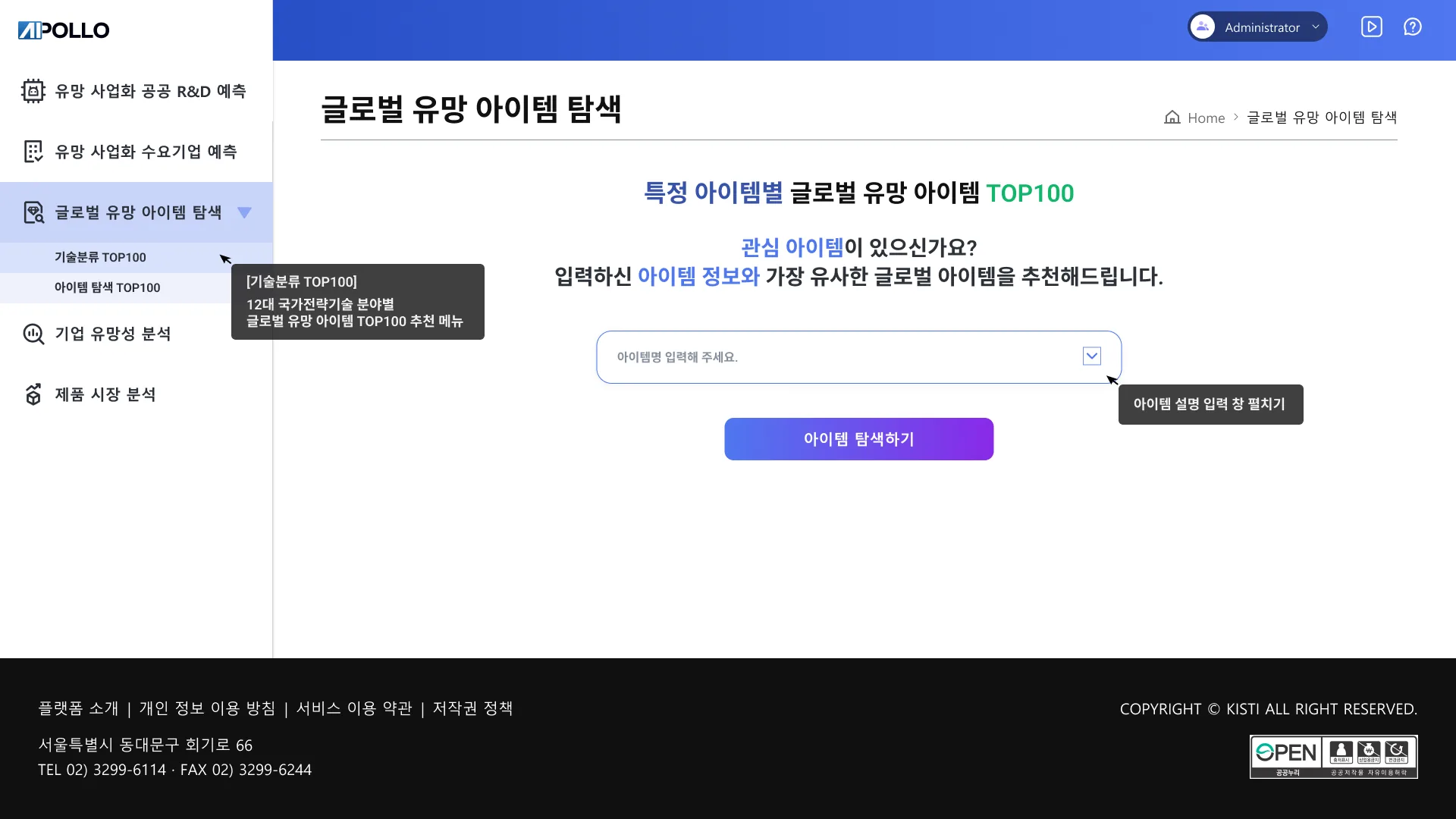
Apollo connects two sides that rarely speak the same language — public R&D labs with technology to license, and businesses hunting for the right innovation. As a government-authorised platform centralising national R&D, it had to hold 30,000+ technologies and dense analytics, yet stay scannable for expert users and credible to government stakeholders. The hard part wasn't search — it was matchmaking.
Research tools live or die on information architecture. I led planning and IA for a data-heavy platform used by demanding expert users.
- Planning and information architecture for the whole platform.
- Structured dense data so it stays quick to scan.
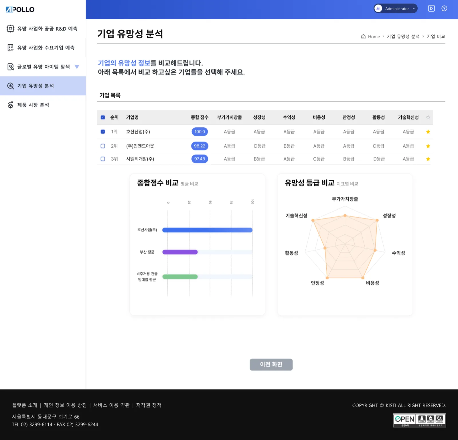
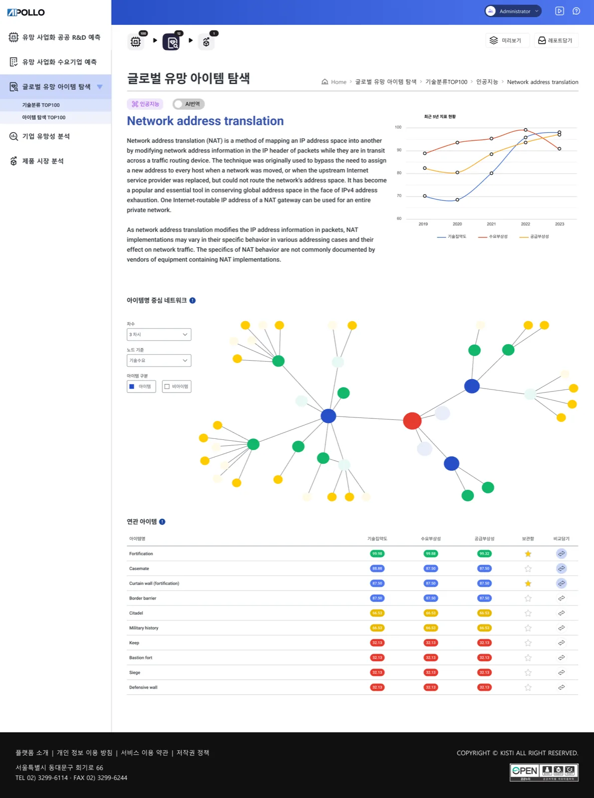
High-fidelity UI across the key surfaces — a Technology Dashboard (tech radar + opportunity feeds), scannable technology profile pages, and a matchmaking interface with guided flows and visual comparison — plus screens like Analytics Model Management, Corporate Prospect Analysis and the public-R&D commercialisation forecast.
- Data-dense screens designed for clarity and speed for expert users.
- Matching cards with compatibility metrics, tag-based technical search and smart recommendations.
- Bilingual KR/EN type system (Noto Sans KR) on a professional blue-spectrum palette, with partnership progress trackers and side-by-side comparison tools.
Built the Apollo Admin design system from the ground up — organised into Input, Display, Feedback and Navigation components, with an icon set and Highcharts-based data visualisation.
- A reusable component library so dense research screens stay consistent and fast to assemble.
- Tables, search-and-filter, navigation (LNB), tabs and charts tuned for data-heavy use.
- 01
Plan
Scoped the platform with the KISTI team and agreed what 'connection' meant in practice.
- 02
Architect
Built the information architecture to make heavy research data quick to scan.
- 03
Design
Delivered high-fidelity UI tuned for expert users.
Density with breathing room
Expert users want to see a lot at once — the layout shows depth without tipping into clutter.
 01 / 0502 / 05
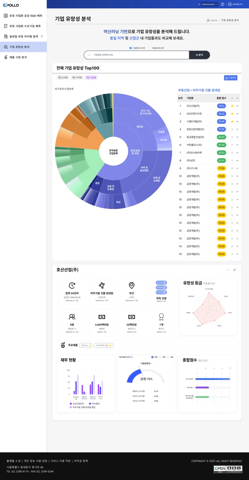 03 / 05
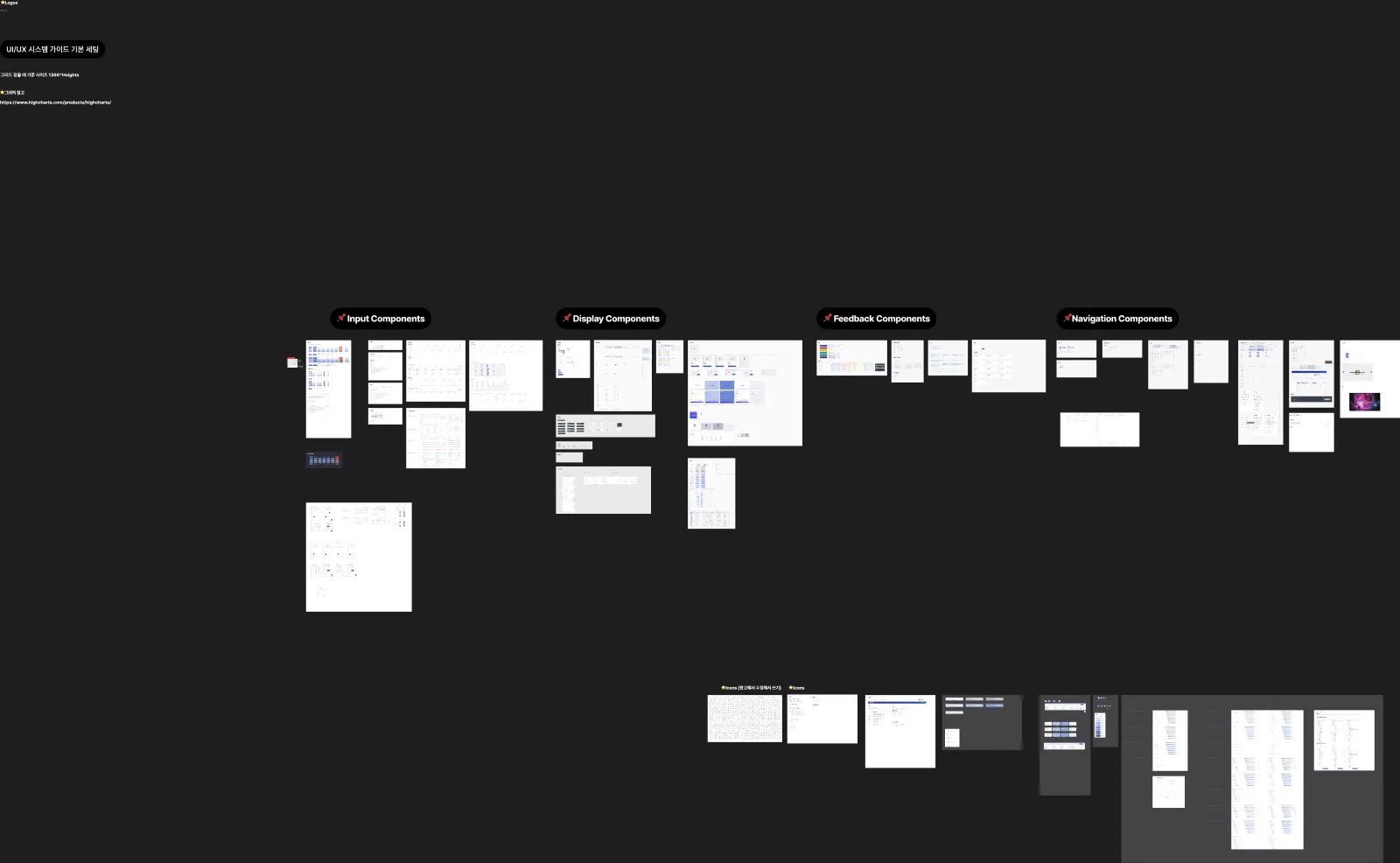 04 / 05
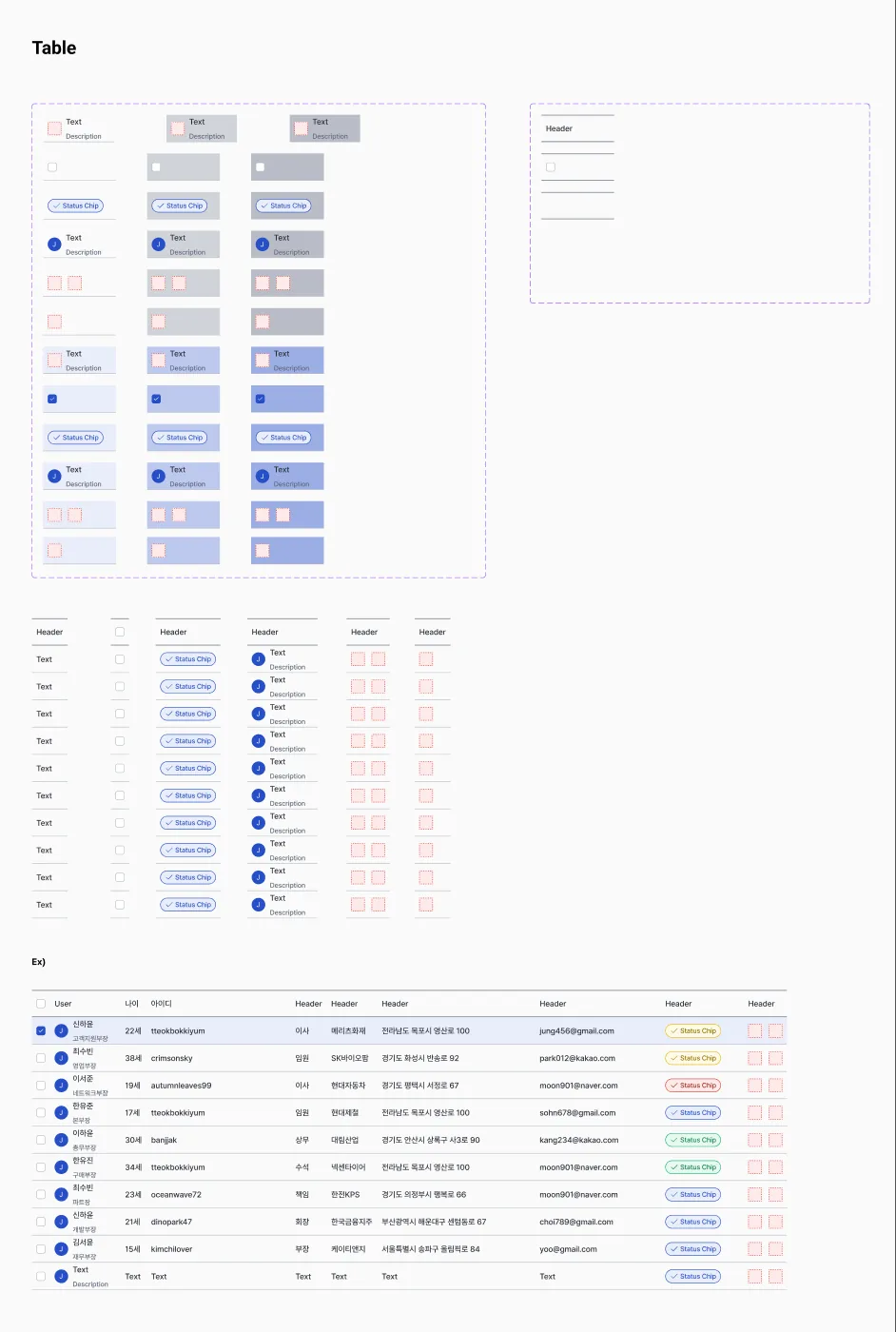 05 / 05
- ✦65% increase in successful technology connections
- ✦92% satisfaction among government stakeholders
- ✦30,000+ technologies actively maintained
- ✦Recognised as a cornerstone of South Korea's innovation infrastructure
Designing at national scale taught me to respect density without fearing it — expert users want to see a lot, fast. The real win wasn't a prettier screen; it was turning plain search into guided matchmaking, which is what actually moved successful connections up 65%.