Gobiz Vietnam — B2B trade marketplace
Gobiz (VGobiz) is a Korean-invested B2B wholesale marketplace for Vietnam and Southeast Asia that connects buyers and sellers, and the admin behind it, running users, inquiries, requests-for-quotation, quotations, orders, buying offers and circular letters from one dashboard.
- Role
- UI/UX
- Timeline
- 2025
- Team
- Astra Technology
- Scope
- Marketplace + admin (BMS) UI/UX
The design had drifted out of sync: the inherited screens and component library no longer matched what engineering was building. The job was to restructure the design system so design and development told one story again, serving buyers, sellers and operators alike.
- 01
Map journeys
Charted buyer, seller and operator paths across the marketplace and BMS.
- 02
Unify
Designed shared components so two surfaces read as one product.
When design and engineering stop telling one story
The inherited screens and component library no longer matched what engineering was actually building, the classic slow drift where every sprint widens the gap. The tempting fix is to patch screens one by one; the real fix was to restructure the design system itself, then re-map the buyer, seller and operator journeys phase by phase so every screen answered to one source of truth. In B2B trade a deal passes through many hands (inquiry, request-for-quotation, quotation, order) and a UI that drifts at any hand-off reads like a business error. So the language got fixed before any screen did.
A trade lifecycle you can read in one glance
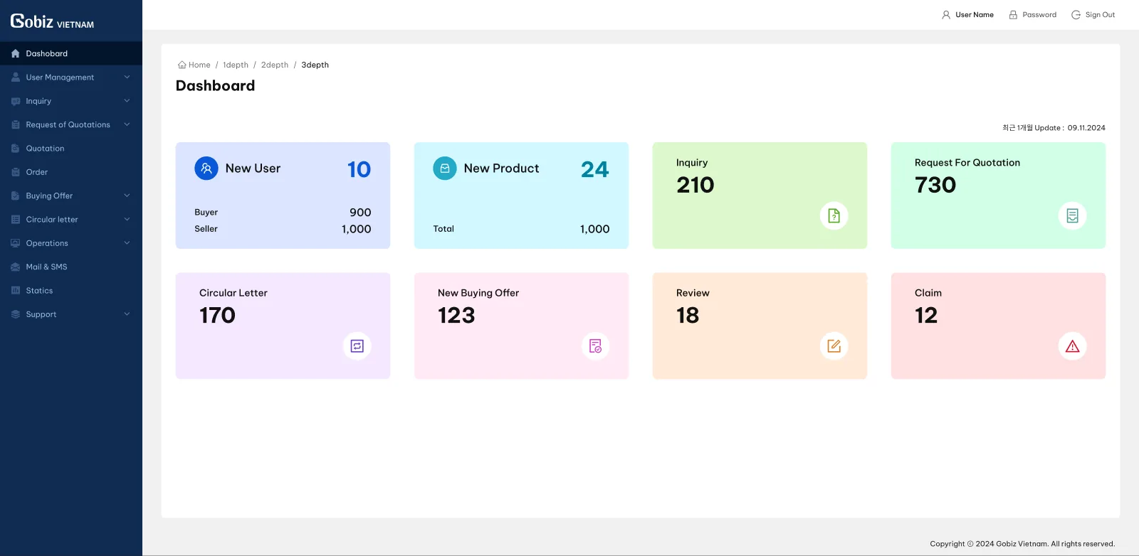
B2B deals don't close in one click. They move through inquiries, requests-for-quotation, quotations, orders and buying offers, with circular letters and claims orbiting around them. The BMS dashboard lays that lifecycle out as a grid of soft, colour-coded stat cards, one per stage, so an operator's first screen answers 'where is trade flowing, and where is it piling up' before a single table opens. The palette is deliberately pastel: a back office you live in all day has to stay calm, so the only card allowed to prick the eye is the reddish one, Claims, the number that actually demands attention.
Marketplace trust starts at the approve button
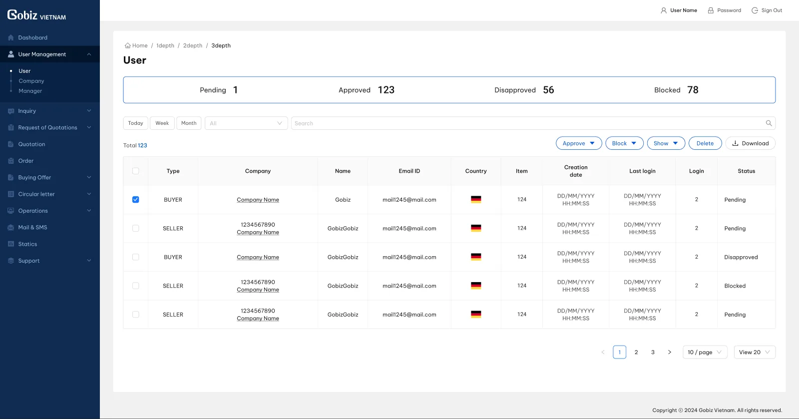
A marketplace is only as credible as its members, so user management earned the most careful table in the system. A status strip (Pending, Approved, Disapproved, Blocked) reads the whole queue at a glance; bulk approve and block keep a heavy vetting day moving; and each row carries exactly what an operator checks before saying yes: buyer or seller, company, country, login history. Because it's the design system's table, the same anatomy repeats across inquiries, quotations and orders: learn this screen once and you can operate the whole back office. Routine is the point: vetting should feel boring, never risky.
Two surfaces, zero seams.
Two surfaces, one product
Rather than design the marketplace and the back-office separately, they share one component language, so users never feel the seam.
01 / 01- ✦A unified design spanning marketplace and management surfaces.
Marketplaces fail when the storefront and the back office feel like two different products. Designing both on one component language meant buyers, sellers and operators all moved through something that felt whole.