Brainiac — homework-helper EdTech app
Brainiac is an EdTech app that helps students learn by getting timely help with homework. I designed the app and a design system from scratch, plus the pitch visuals, work that contributed to a $150K seed round.
- Role
- UI/UX · Product Consultant
- Timeline
- 2022
- Team
- Early-stage EdTech startup
- Scope
- App UI + design system + pitch visuals
An early-stage EdTech startup needed a credible, friendly product and a story strong enough to raise: designed from scratch, with no existing system to build on.
- 01
Define
Shaped the learning loop and the product's friendly, credible tone.
- 02
Systemise
Built a design system so a small team could move fast and stay consistent.
- 03
Design & pitch
Designed the app and the pitch visuals used to raise the seed.
Friendly to students, credible to investors
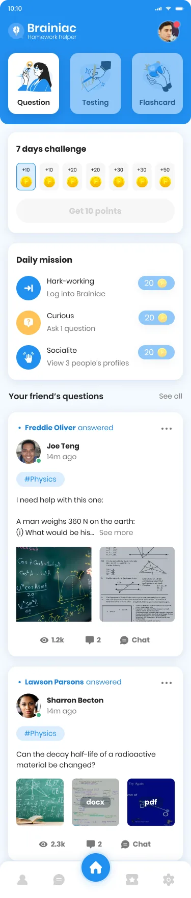
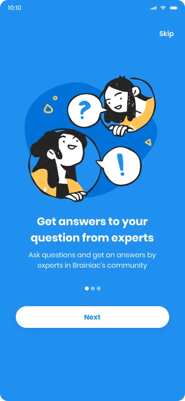
Everything started at zero: no system, no screens, only a startup that needed to look credible to investors and parents while staying warm to the students actually using it. The visual answer lives in that balance: one confident blue, hand-drawn characters with speech bubbles for the human moments, clean white cards and disciplined type for the functional ones. Onboarding leads with people, not features ('get answers from experts') because for a homework app, the promise that someone will help you is the product.
Ask, get help, learn — then come back
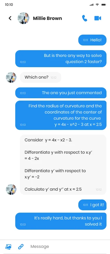
The core loop (ask, get help, learn) only works if students actually return, so the home screen is built like a place, not a form. A feed of friends' questions makes getting stuck feel normal: you scroll past a physics problem someone photographed at their desk and see it answered. Around it, light game mechanics (a seven-day challenge, daily missions worth a few points each) give a reason to open the app before homework goes wrong, not just after. Help is the engine; the feed and the streaks are the flywheel.
From rescue moment to study habit
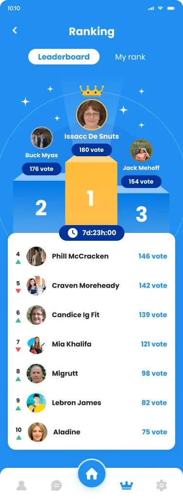
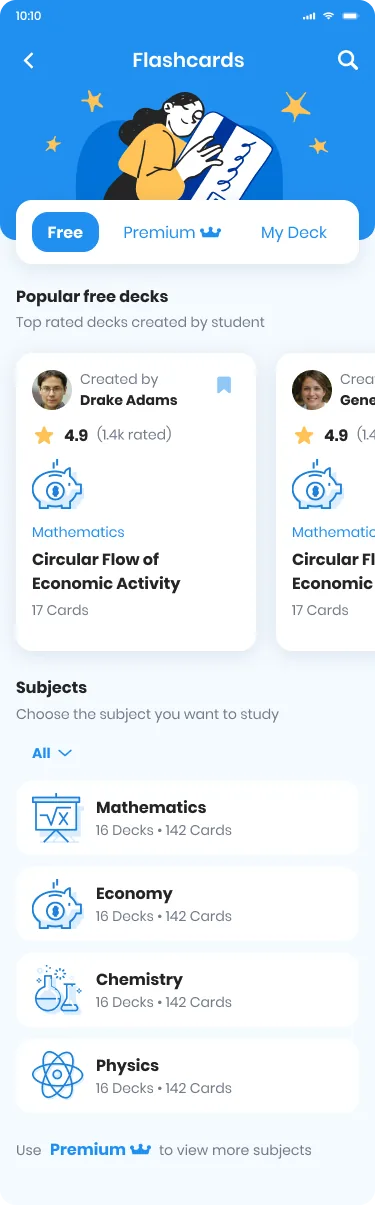
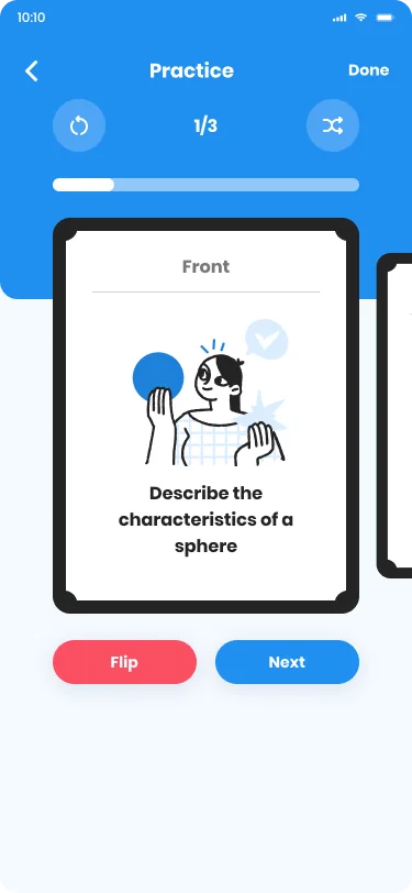
A homework helper that only hands out answers teaches dependence, so the app grows study tools around the rescue moment: flashcard decks by subject and 15-minute practice tests created by the community, with scores, ratings and progress bars that make improvement visible. The leaderboard runs on peer votes (a podium, a crown, a live countdown) so status is earned inside the community rather than handed down by grades. It's the 'friendly, not childish' balance applied to mechanics: playful enough to pull students in, serious enough to respect the work.
One system for the app and the deck
At pre-seed there is no product history to point at. The design has to carry the argument. So the system was built to serve two audiences at once: reusable components and a warm visual language that let a tiny team ship consistent screens fast, and pitch visuals cut from the same cloth, so the deck investors saw looked exactly like the app students would get. That continuity is quiet but persuasive. It says this team can execute. The work fed directly into a $150K seed raise, and left behind a design system the team could keep building on.
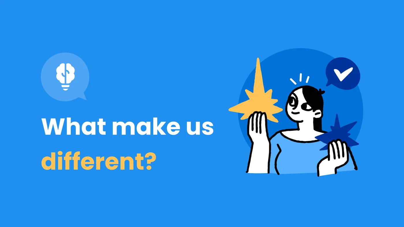
At pre-seed, design is the proof.
Friendly, not childish
A tone credible to investors and parents while still warm to students, a hard balance for EdTech.
Design the pitch, too
The product visuals doubled as fundraising assets, design carrying the story into the raise.
01 / 0902 / 09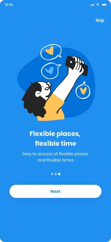 03 / 09
 04 / 0905 / 09
 06 / 09
 07 / 09
 08 / 0909 / 09
- ✦Contributed to a $150K seed raise
- ✦A coherent app + design system for a small team to build on
At pre-seed, design is the proof. A clear product and a confident pitch helped turn an idea into funding, and a design system meant the small team could keep that quality as they built.